Card Optimization
UX | UI, Web App Design
Overview
Project Context
Company: clevergig - clevergig.nl
Company description: clevergig provides ad hoc scheduling software for temp agencies and staffing intermediaries in the Netherlands. In addition to scheduling, agencies can use the clevergig software for many other things including tracking and approving work logs as well as generating reports.
Sector: SaaS, B2B
Year: 2023
Collaboration with: Development team
My role: I was the sole designer on this project responsible for both the user experience and the visuals.
The Challenge
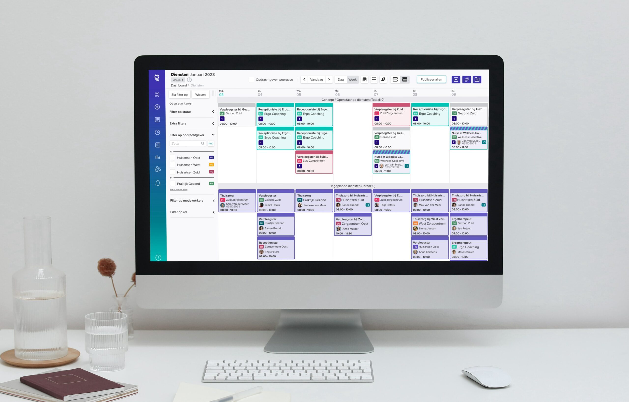
clevergig's product allows their customers to plan and schedule their workforce at various organizations. They do this by creating various shifts that are viewed in the form of individual cards. The need to optimize the cards came about for two main reasons. Firstly, clevergig's customers were growing their agencies. Secondly, clevergig was landing larger customers. In both situations, more shifts were being scheduled within the platform which the current overview did not support.
How Might We
The question at hand was, how to optimize the shift cards in order to allow for more to be shown on the screen, without sacrificing the usability, the performance, or the crucial information users need to do their work.
Discover & Ideation
The Research
A quick round of user research conducted through interviews and surveys highlighted what information users found on the current shift cards to be less important. This allowed me to create a hierarchy of information and determine which data could be excluded from the initial card view. Based on my findings, it was clear that the organization name, the time of the shift, and the worker's name were the most important to all the users questioned and that the other information shown was secondary.
The Cards
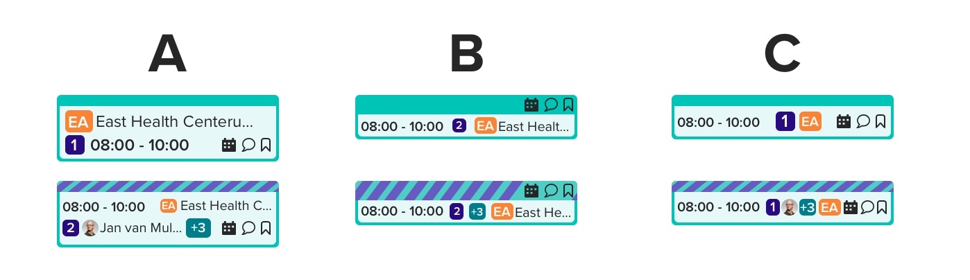
From the research conducted, I excluded the shift title and rearranged the data in a few different versions. By doing this, it was clear that a reduced shift card would be easily obtainable. The questions remaining were how reduced could we make the cards, and how much of the information would the users prefer to see. A preference test was sent out to our users highlighting the three final iterations of the compressed cards. The results showed that 85% of the users were in favor of option A, which was still 50% smaller than the current card sizes.
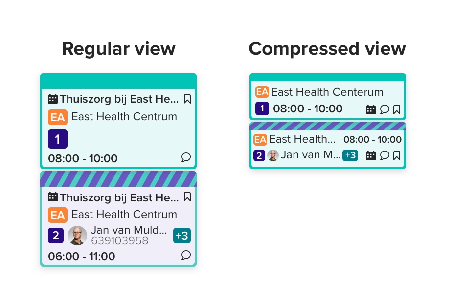
Customization
Another key consideration taken into account was that not all users would want or need a compressed view of the shift cards. The platform allows users to tailor their experience. In order to maintain this approach, a toggle was implemented allowing users the option of changing between the regular and compressed view.
Outcome
Conclusion
The option to view the shift cards in a compressed format was implemented with positive feedback from our customers and without sacrificing the platform's performance while rendering larger quantities of data.
© Sarah Eisman 2025