Nalu
UX / UI Design
Overview
The Project
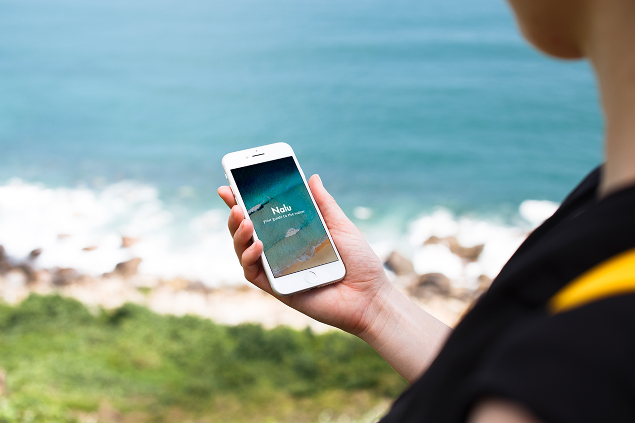
Nalu is a weather forecasting app for water sports. It aims to provide users with easy-to-access data so they can stay safe while being on the water.
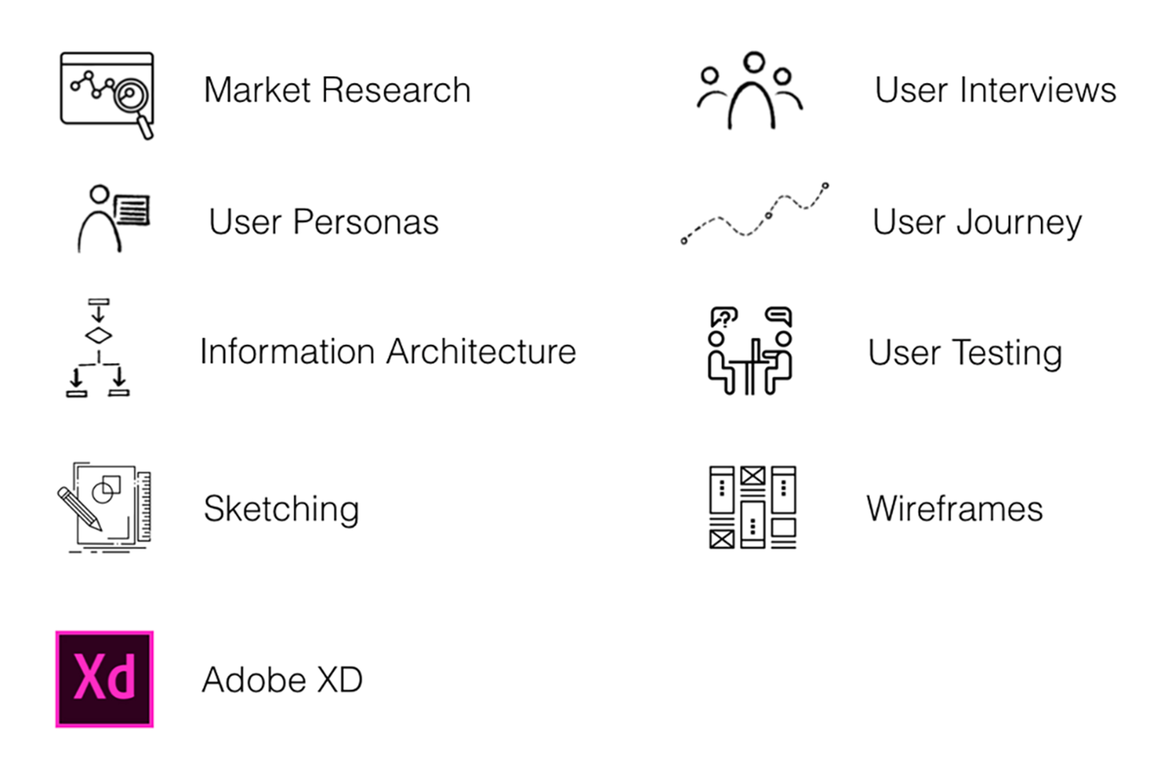
I was the sole designer on this project, responsible for the UX and UI. I used Adobe XD for the designs, the prototyping, as well as the animations.
The Challenge
Being on the water has many challenges, but understanding the weather forecast should not be one of them. This project focused on how to enhance people's experiences when planning their water sports activities by giving them a user-friendly and thoughtfully designed weather application.
Goals
From cluttered to functional
To display the weather data in ways that are both usable and convenient. The goal is to make the data understandable for both novice and experienced users.
Amplify the experience
Differentiate the app from its competitors by increasing usability. Focused on addressing the market's frustration with existing apps.
My Role
I was responsible for the end-to-end UX and UI design for this project. I conducted various rounds of market and user research with water sports enthusiasts and received constructive feedback from users and other UX designers that supported further iterations on the prototype.
My Approach
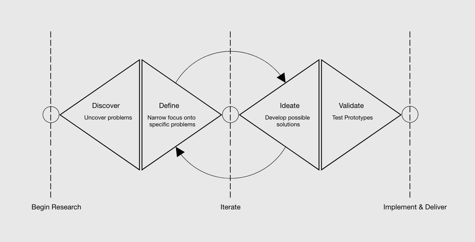
Discover
Market Research
The research phase was key to learning what is currently available to users and in what ways these applications could be improved. I did a competitor analysis on a handful of forecasting apps that focus on water sports.
Then I did a SWOT analysis and UX analysis to identify the potential areas for improvements.
Findings
I concluded that the primary areas of improvement to be made are:
- Clear and understandable navigation is crucial. Users must know where to go for the information they need.
- Simpler displays of data will ensure that users do not get overwhelmed and discouraged.
User Interviews
Customer interviews provided valuable insight and understanding into how and why they use weather apps as well as what they would need to have a better experience.
I spoke with five people within my network who actively participate in water sports at various skill levels. It was inspiring to hear them speak about their love of water sports and the current challenges they face.

Findings
- It is very time-consuming to look at multiple applications to get all the weather reports related to water sports.
- Screens are often packed with information making the data difficult to understand.
- Navigation of existing apps is not intuitive which makes it difficult for users to access necessary information.
User interviews confirmed my initial hypotheses from the competitor analysis that clear navigation and simpler displays of data are important to users. They also brought to light additional areas for improvements that the design of Nalu will have to address.
The Problem
Water sports enthusiasts need a way to see weather and water-related conditions specific to their sport clearly and concisely. They do not want to spend time analyzing multiple sites or having to decipher information when they are planning a day out or are already on the water.
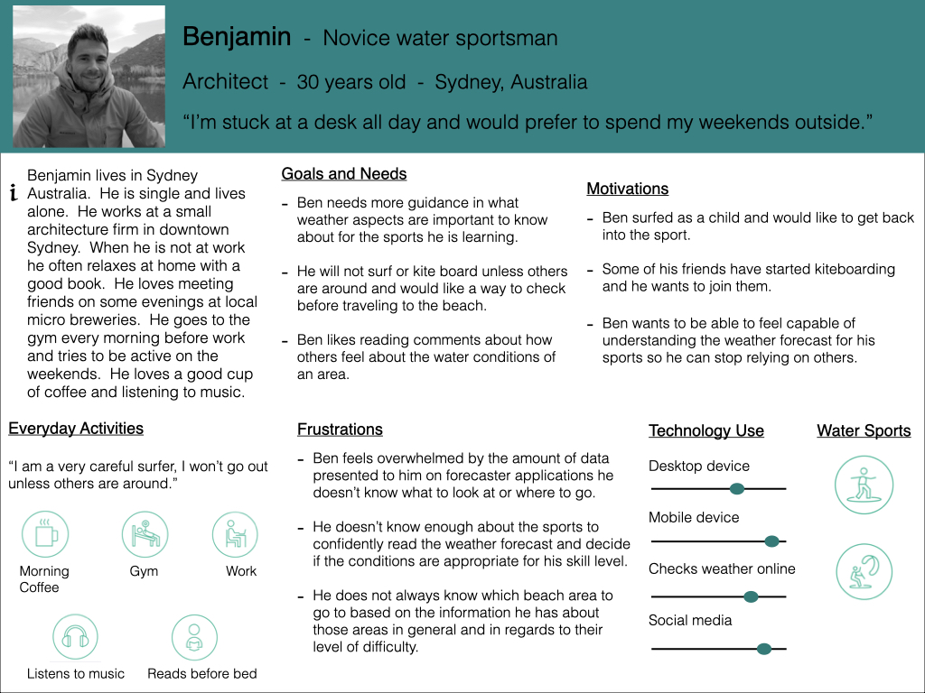
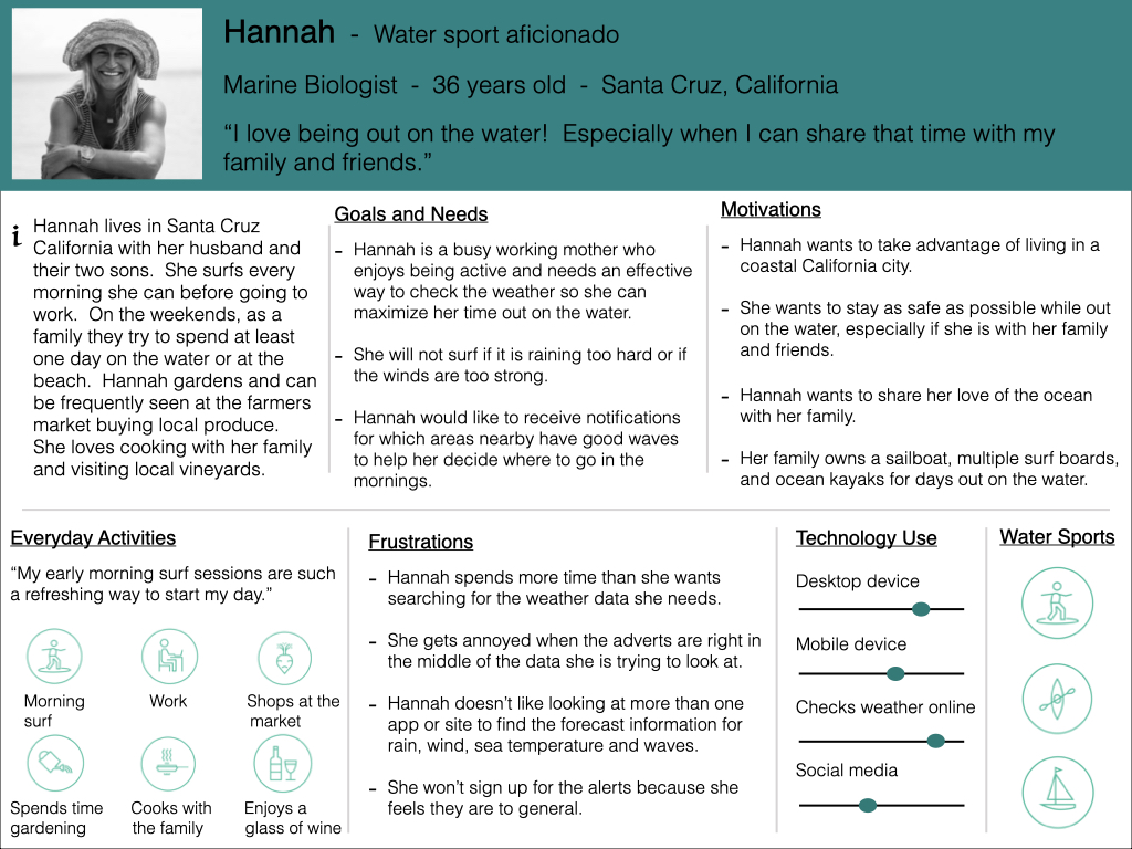
I synthesized the data collected during these interviews and came up with two personas that represent the scope of prospective users.
User Personas
This foundational research informed my design decisions. I put pen to paper to further develop a user’s movements as they journey through the app. I created task analysis and user flows to provide the initial preparation for designing the framework.
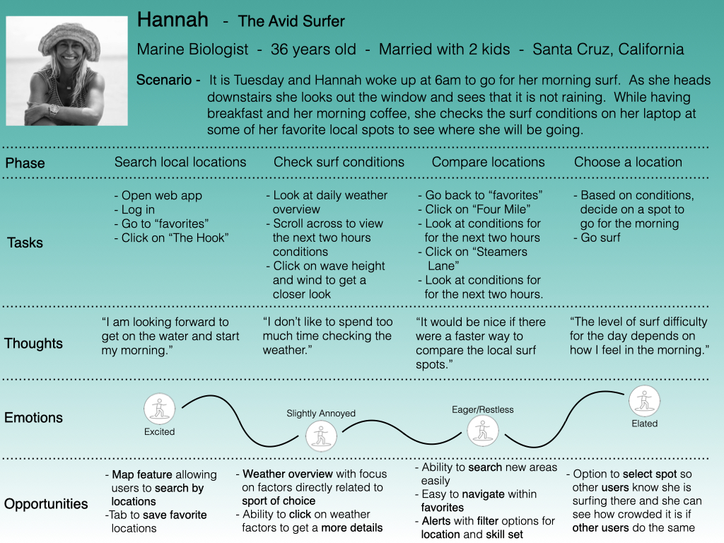
Next, I used journey maps to envision the end-to-end experience of a user progressing through Nalu. Journey maps are important because they focus on both the physical and emotional progression of a user while completing a task.
Based on the data gathered, I was able to highlight the user’s feelings concerning each task. This provided insight into potential features that could enhance a user’s experience in the app.
Journey Maps

Ideate
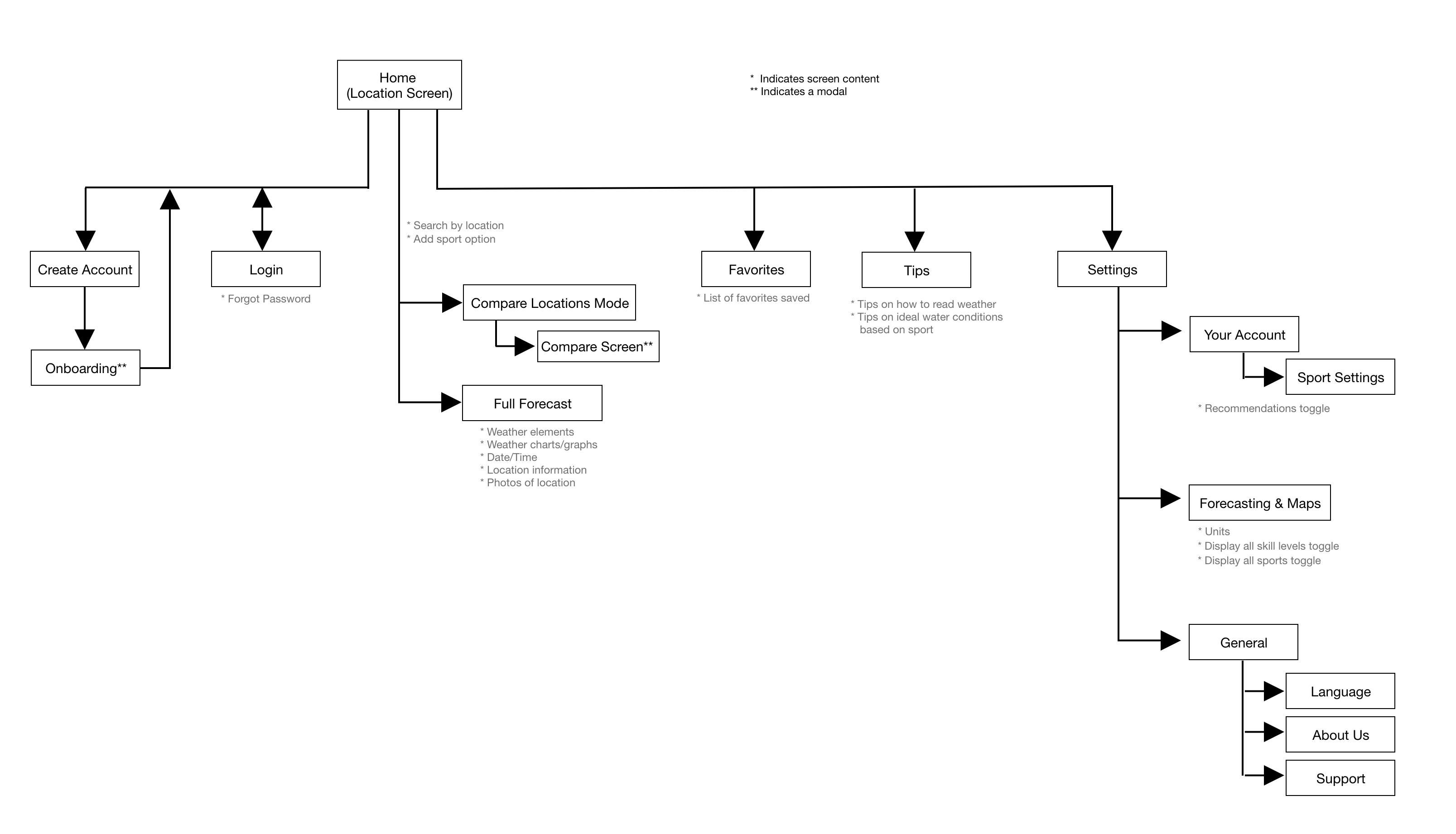
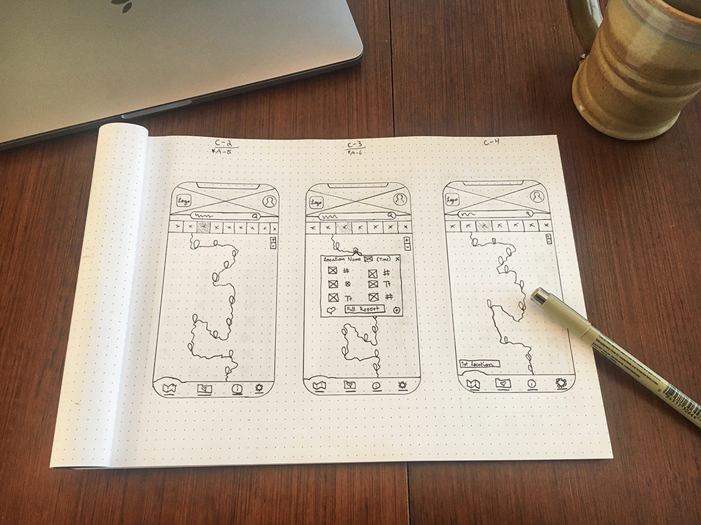
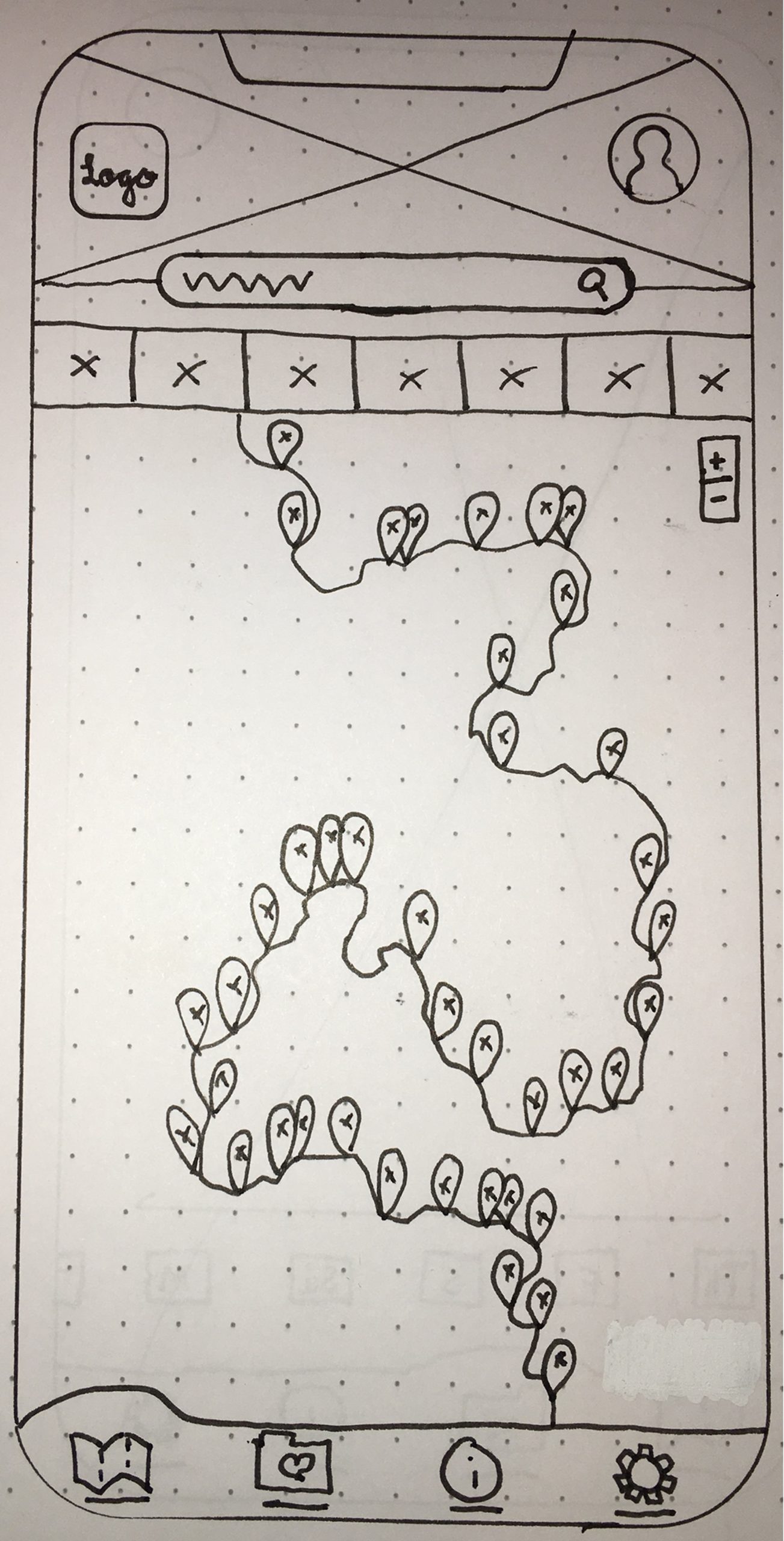
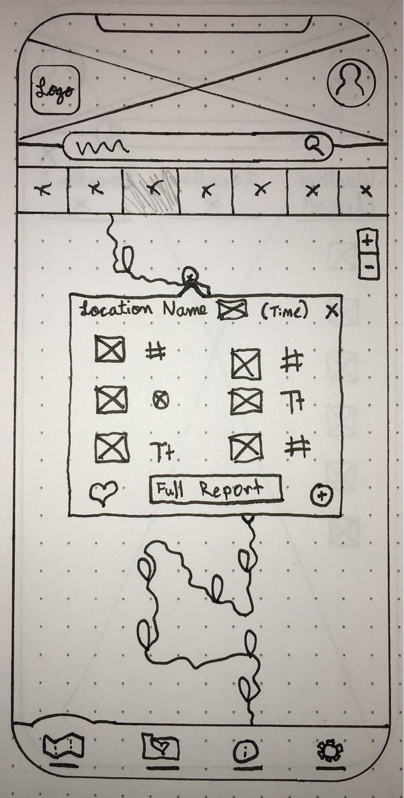
These initial steps led to the development of the informational architecture of the app, sketching wireframes, and feature ideation. All my preliminary sketches and low-fidelity wireframes were done with pen and paper allowing me to rapidly iterate on my designs. I found this to be beneficial later on when I began using a design tool.
I chose to develop and document three features to learn how the personas would maneuver through these tasks:
Customize sports settings.

Add a location as a favorite.
Compare locations to discover the best water conditions.
Sitemap & Sketching
Validate
Testing the Prototype
After initial iterations, it was time to test my prototype. Testing provided an invaluable learning opportunity. It involved six participants, each with varying degrees of experience in water sports activities. The test took 20 to 30 minutes and involved preliminary questions to gain insight into the customer’s goals and frustrations when using weather forecast apps.

Test Objectives
- Discover if users can add a sport and customize the sport level settings.
- Determine if users can “favorite” a location.
- Discover if users are able to compare multiple locations.
- Determine if the existing navigation encourages users to complete their goals.
Key Takeaways
Analyzing the data revealed which elements were the most impactful for the customer’s journey through the application. It highlighted important elements that needed to be iterated on.
- How to customize sports parameters is not very clear.
- Adding a favorite is too many steps.
- Icons are too small, making them hard to differentiate between.
- The black text on the compare feature is too small to read clearly.
- Unclear how to edit sports parameters once saved.
Iterations
Location Screens (no sport selected)

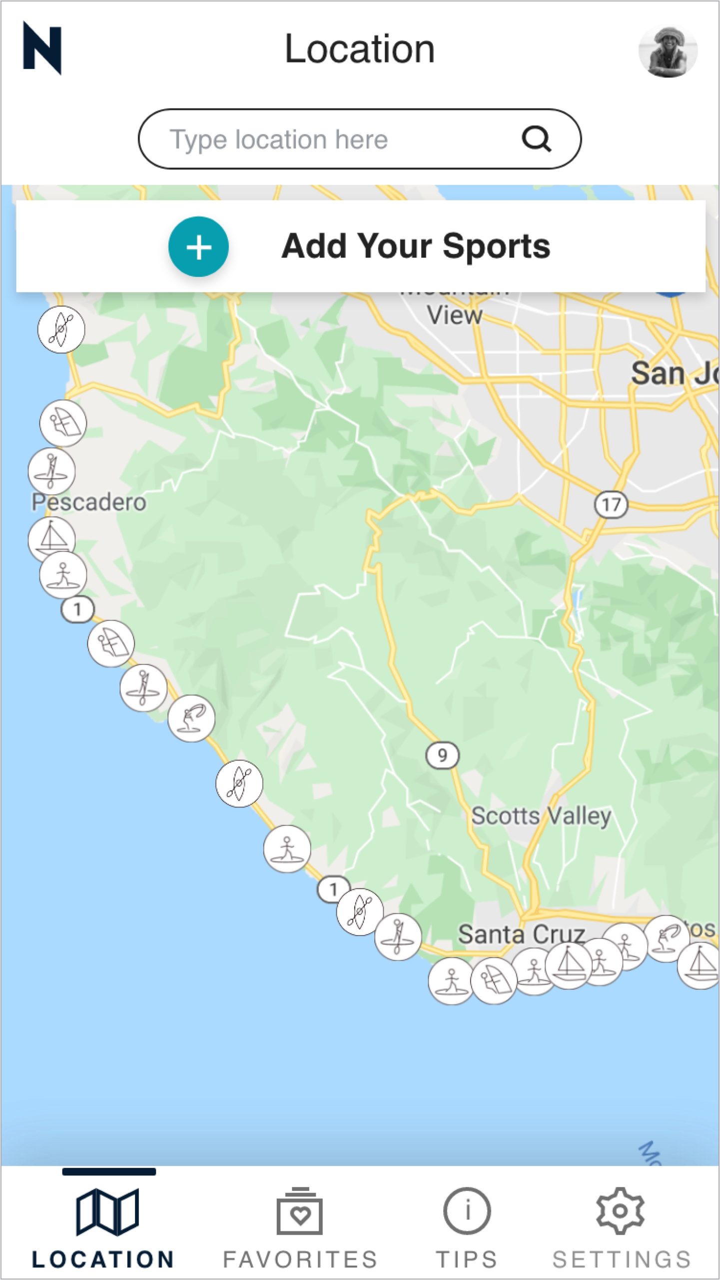

This is the progression of the design for the location screen. Throughout the iterations, the design has become cleaner with more white space being utilized. Overall the functionality and UI have been improved.
Feedback from user testing guided me to change the sports icons from line icons to solid icons for better visibility and differentiation.
Sports Settings
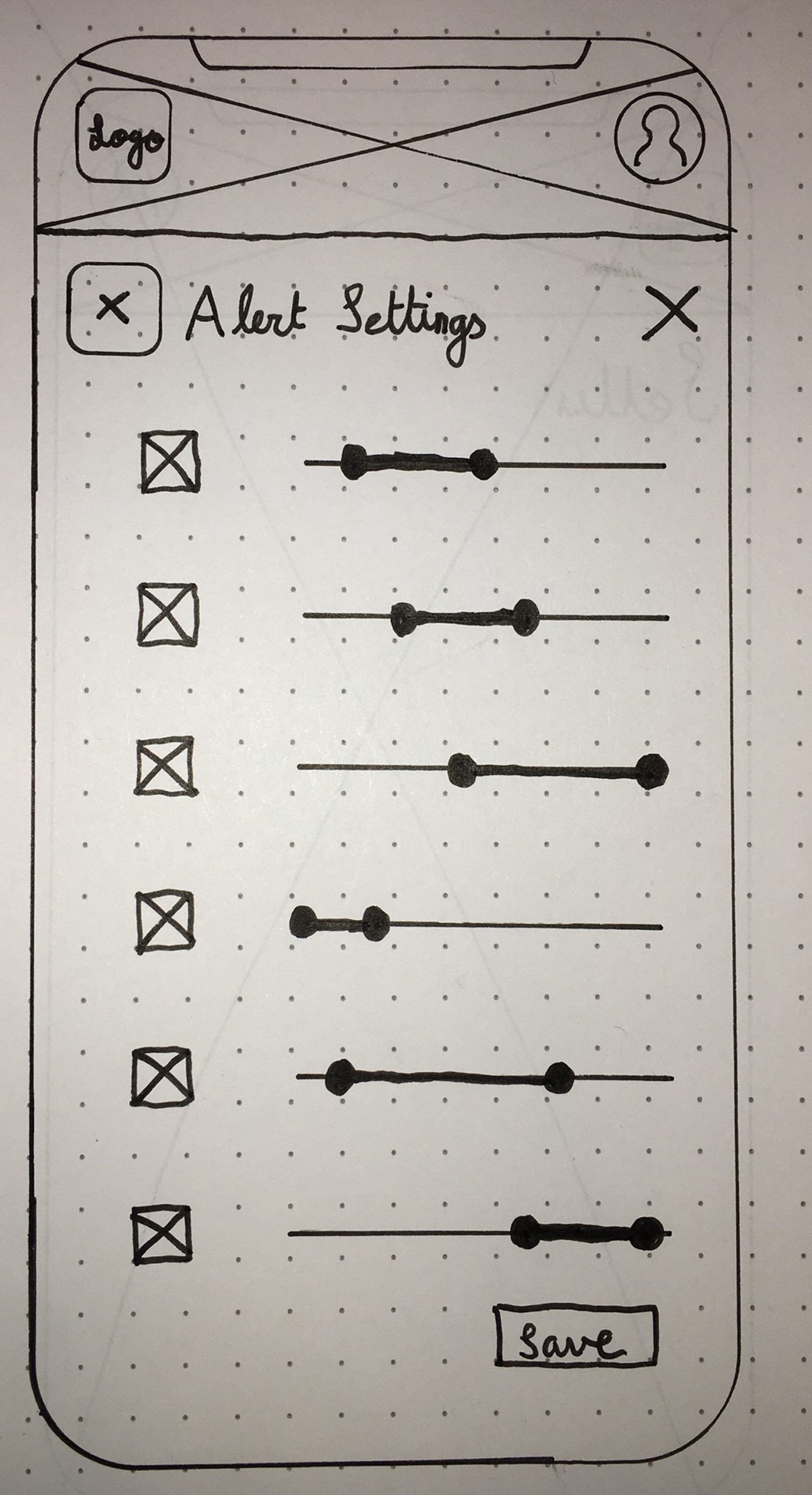
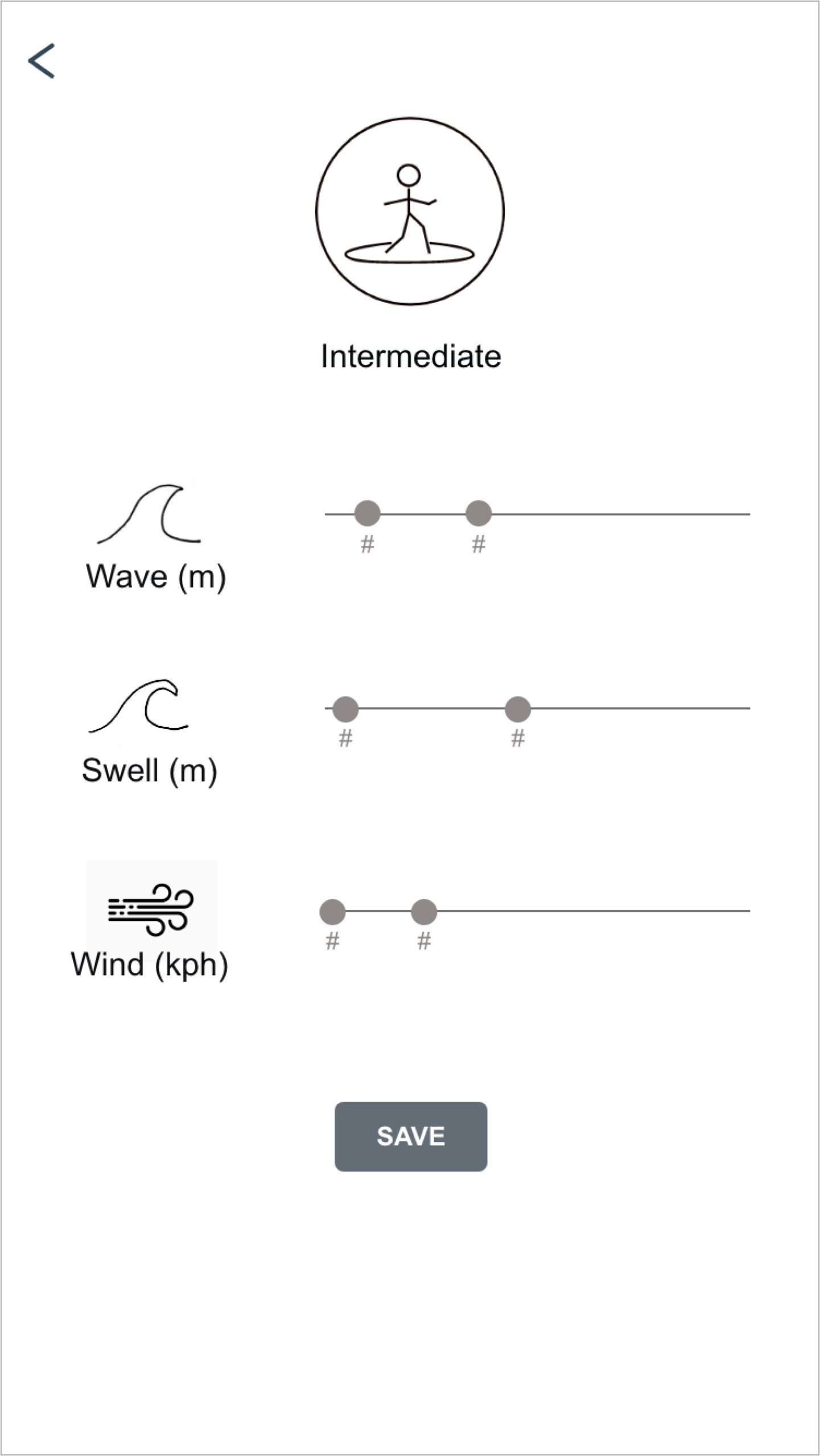
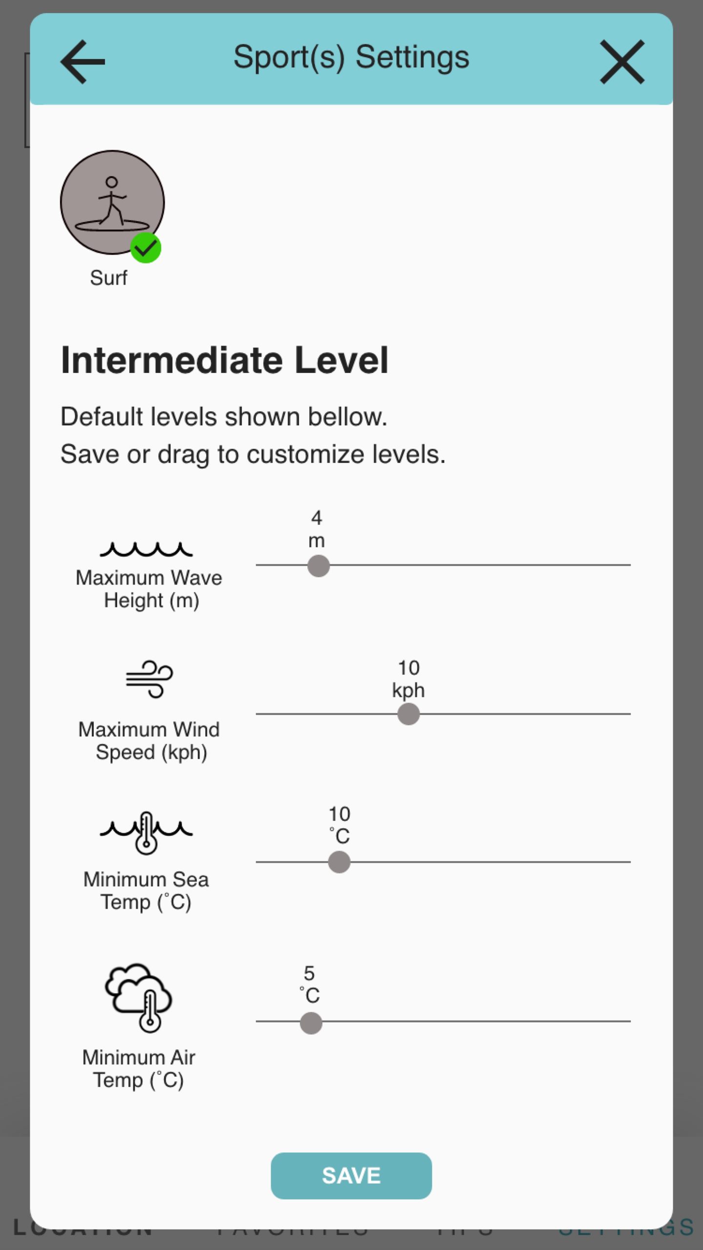
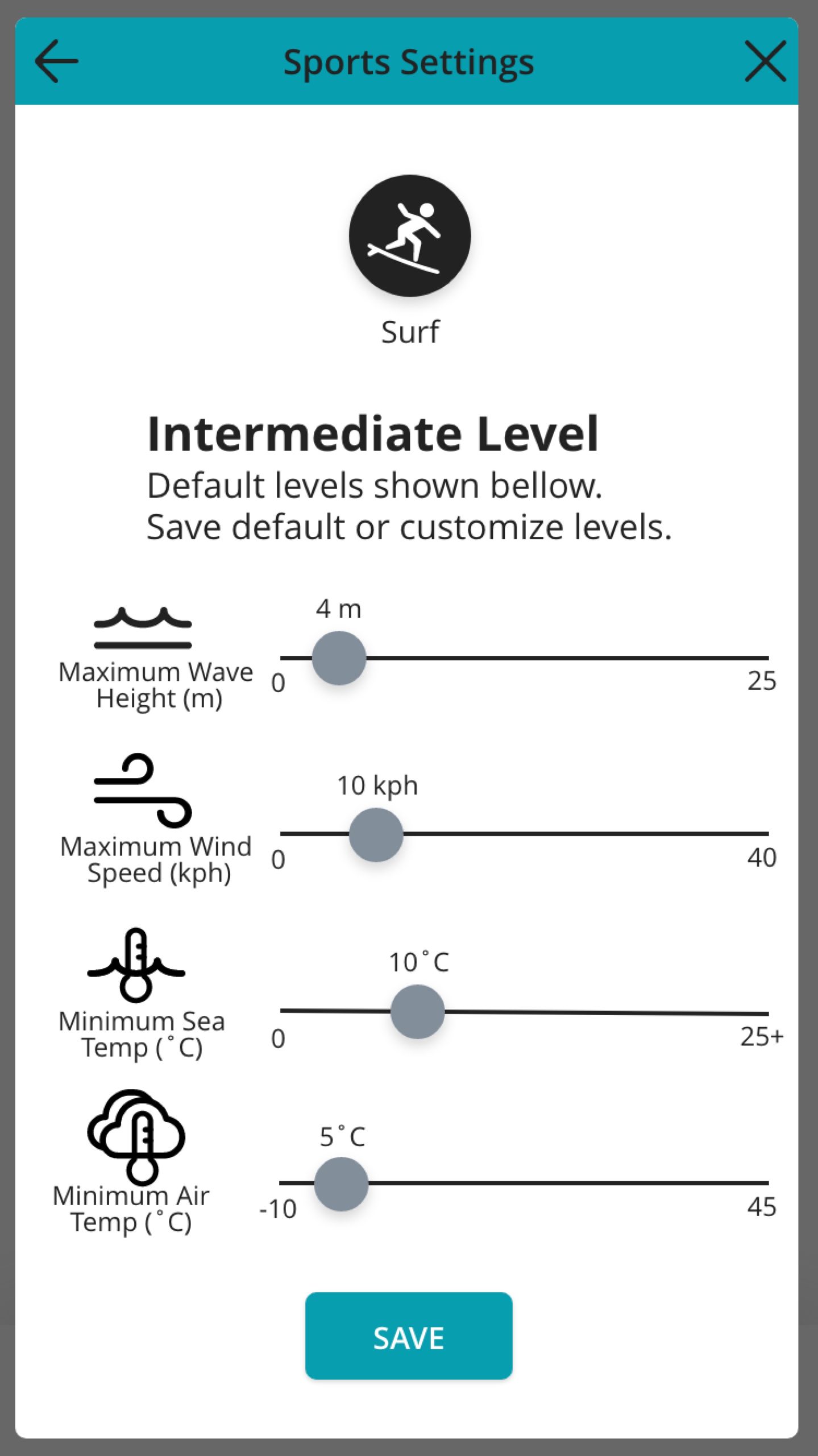
This is the progression of the design for the sports settings screen. While initially this was designed as a filter for alerts, early on in the iterations it changed to be filters for sport levels.
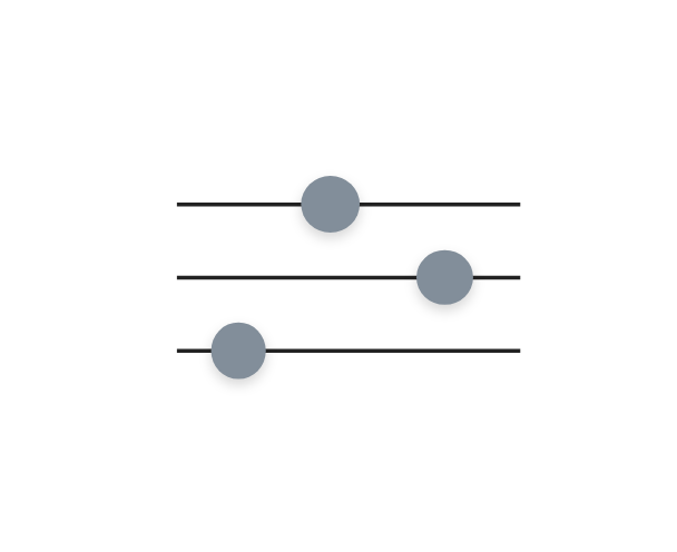
User testing provided insight into which of the weather elements would be necessary here for surfers. I was also guided by the feedback to change the slider to only adjust one quantity, either minimum or maximum, rather than being able to adjust both (change seen from mid-fidelity to high-fidelity).
As the icons changed from lined icons to solid icons, the selected states changed as well.
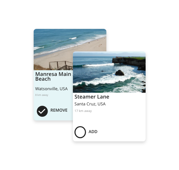
Location Card

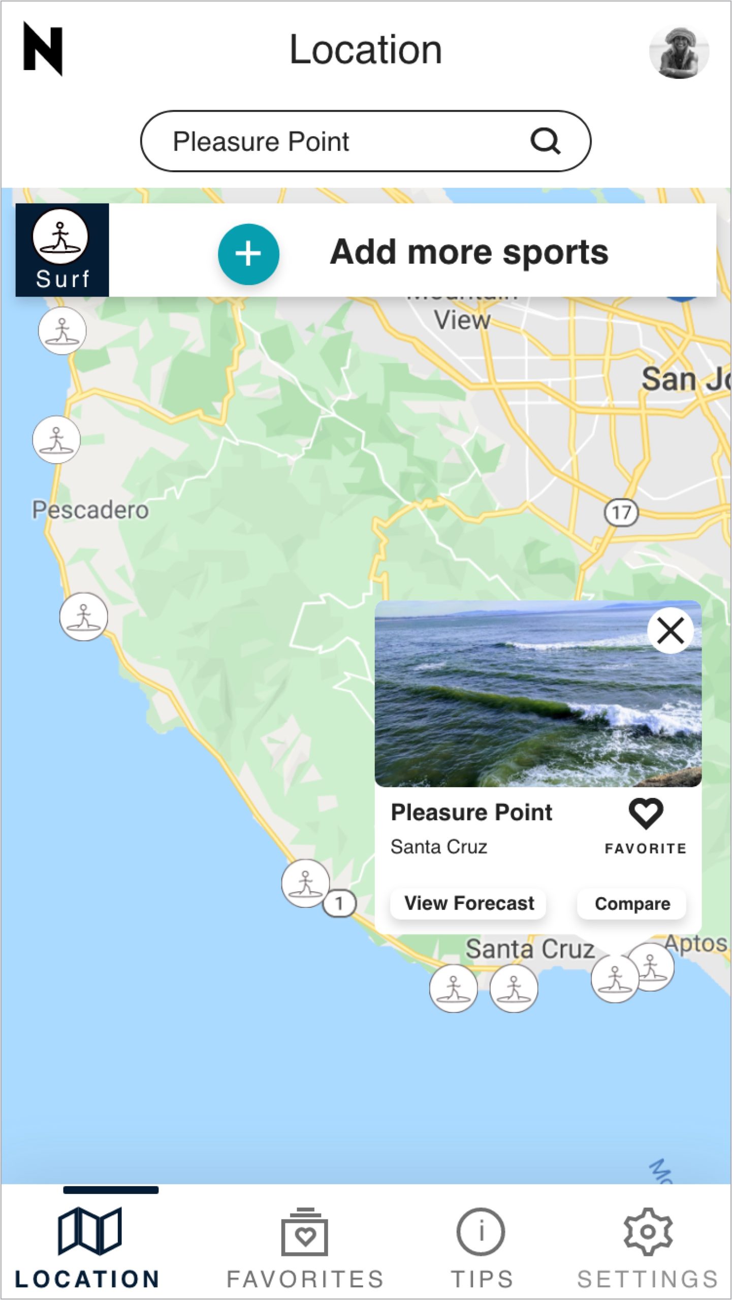
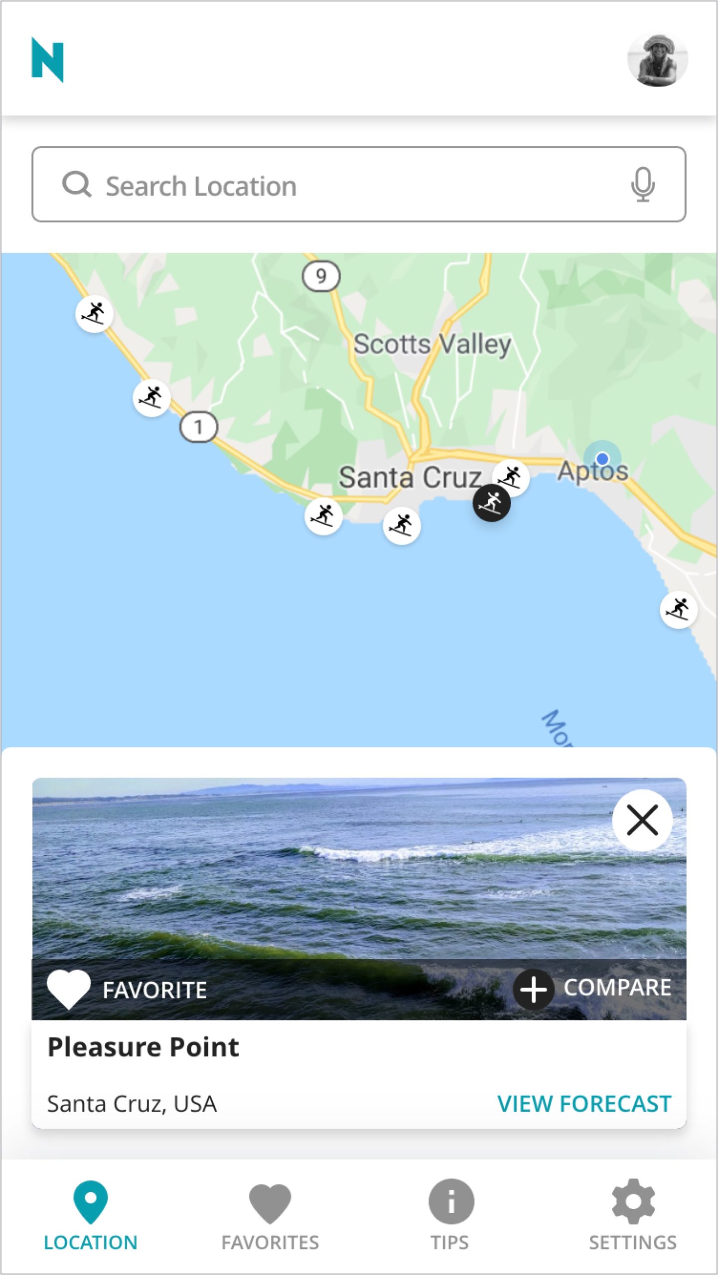
This is the progression of the design for the location cards. These went through many iterations. Initially, I had this as a mini forecast, with just the essential information a user might need to make a decision. I ended up opting for a cleaner design prompting the users to view a full forecast with all the information.
The cleaner design allows the user to not have to enter the full forecast to add a location as a favorite or to go into the compare mode. User testing confirmed that users wanted to be able to favorite a location without viewing the entire forecast.
The final version has a larger card to ensure that card elements are not too cramped while still being able to highlight the location on the map.
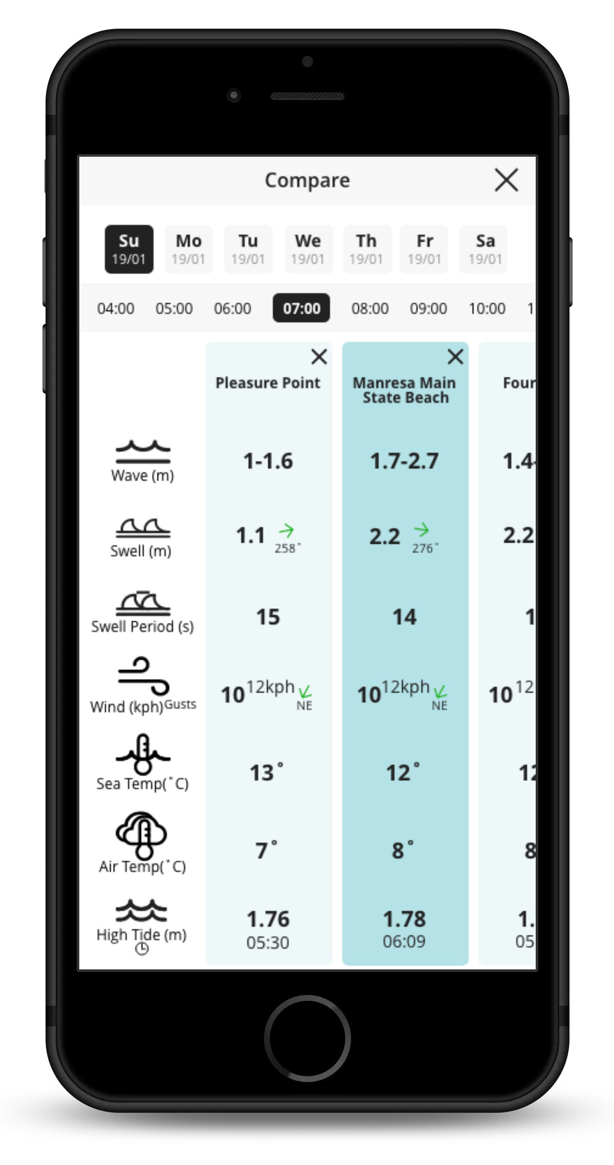
Compare Screens
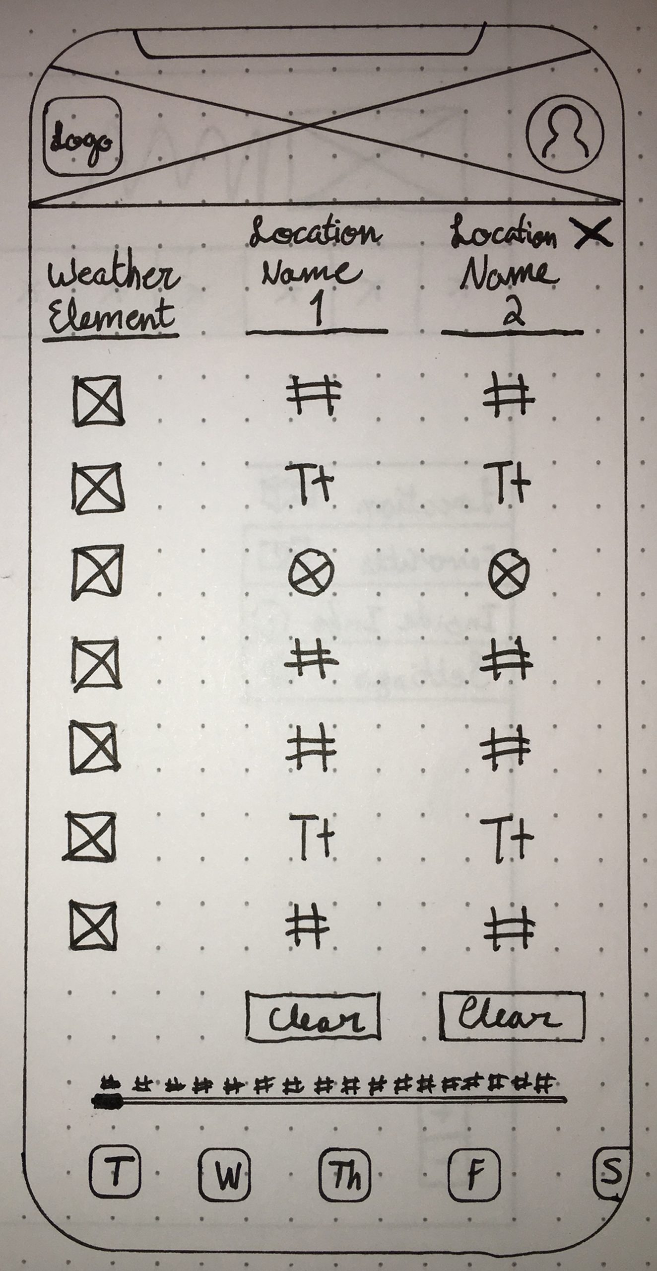
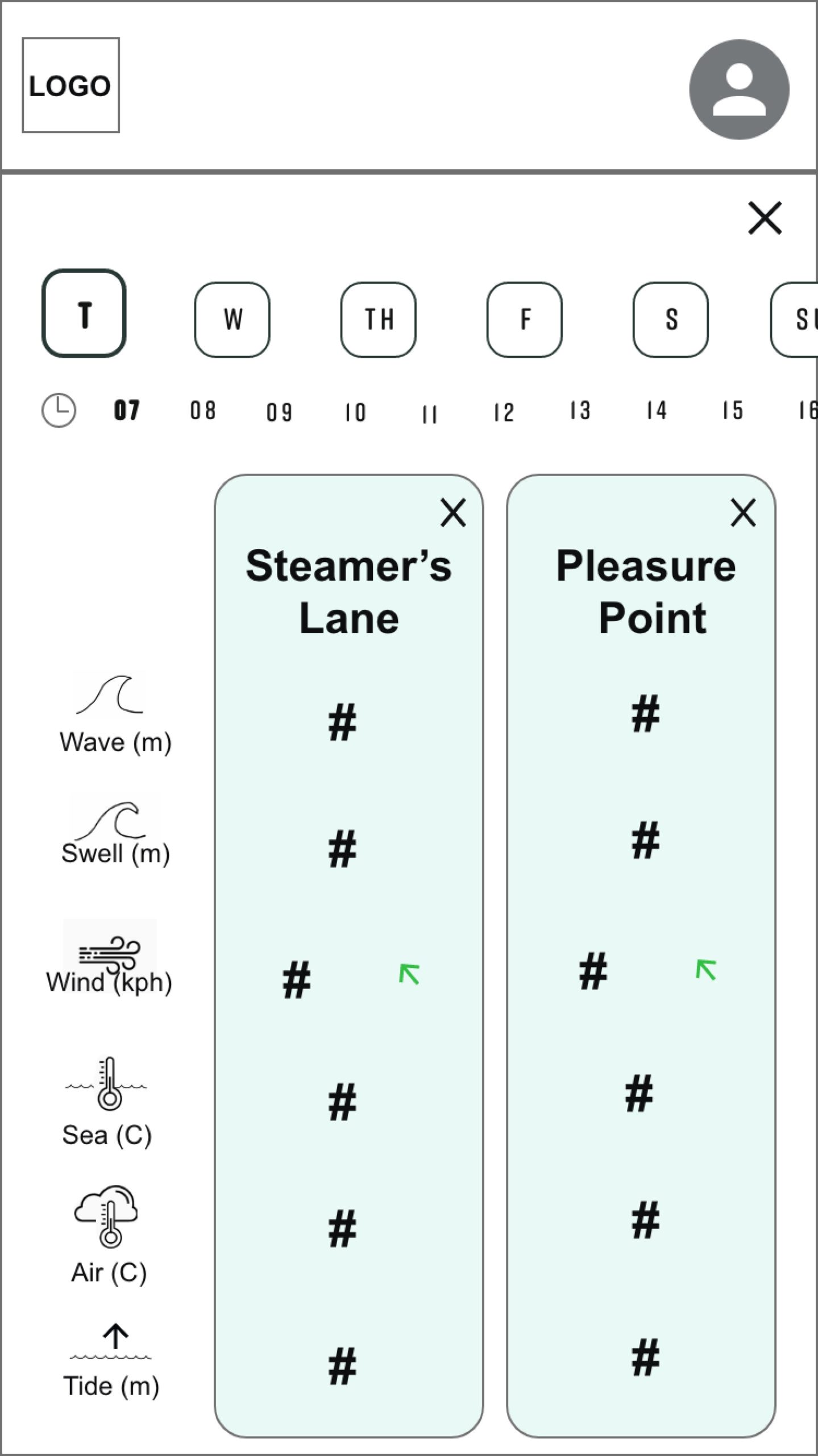
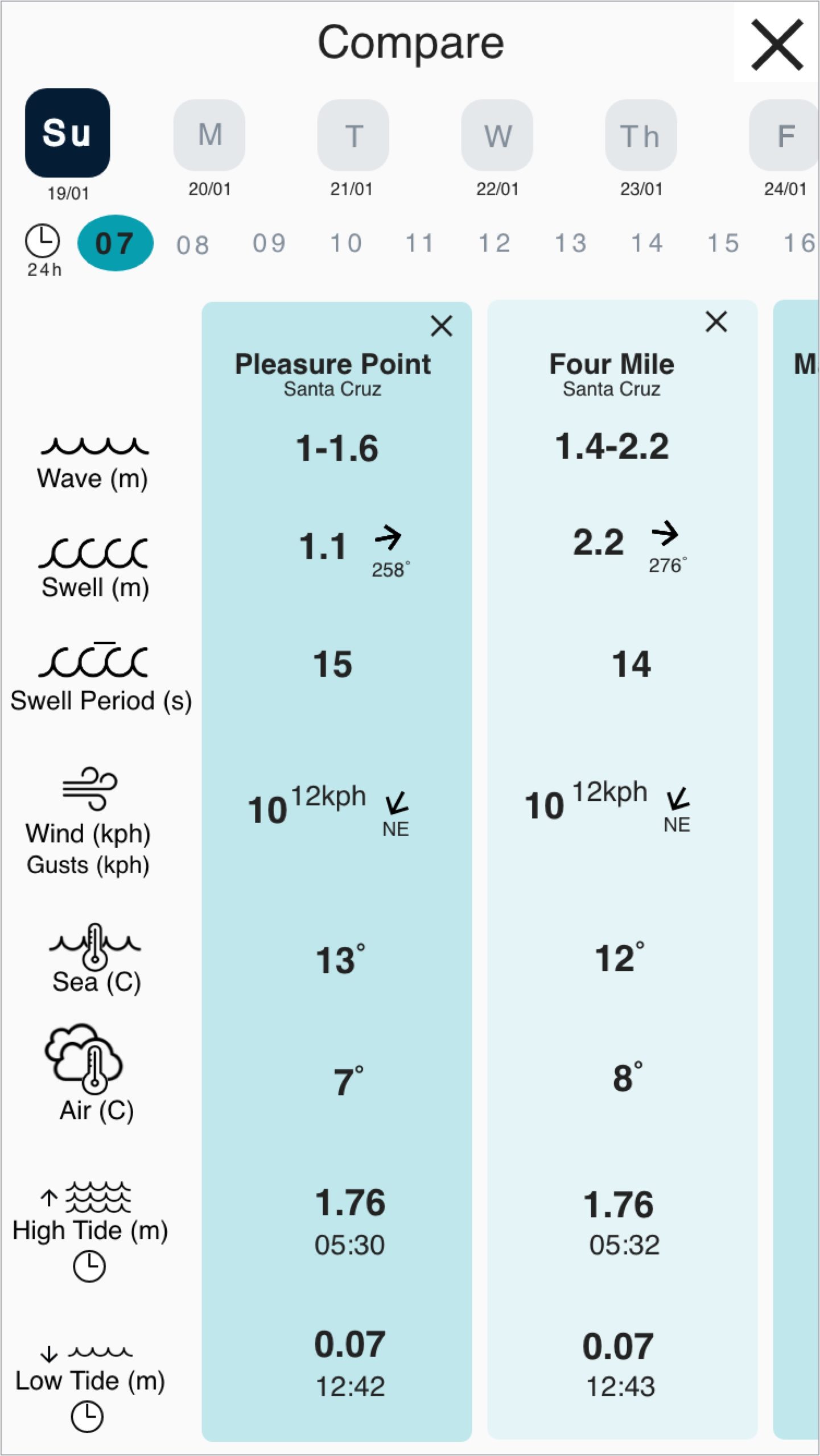
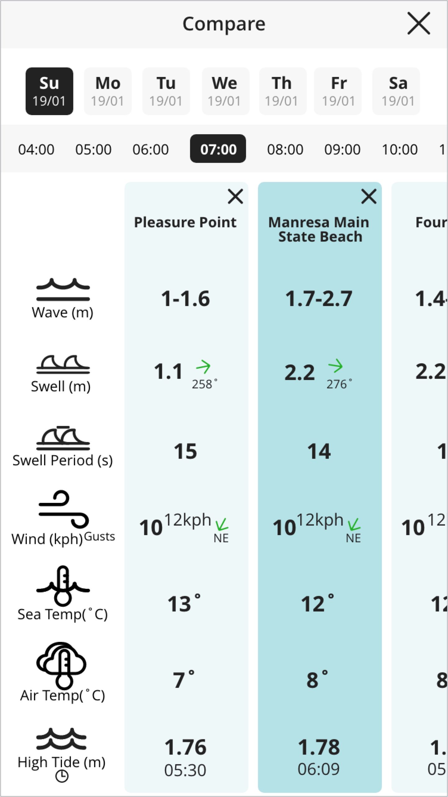
This is the progression of the design for the compare screen. While the overall idea of these screens did not change very much, the UI did.
Initially, I limited the comparison to two locations, however this changed after hearing feedback in user testing that they would want to be able to compare more locations. The weather icons were given a heavier weight for better visibility and to provide for better spacing.
Detailed Design
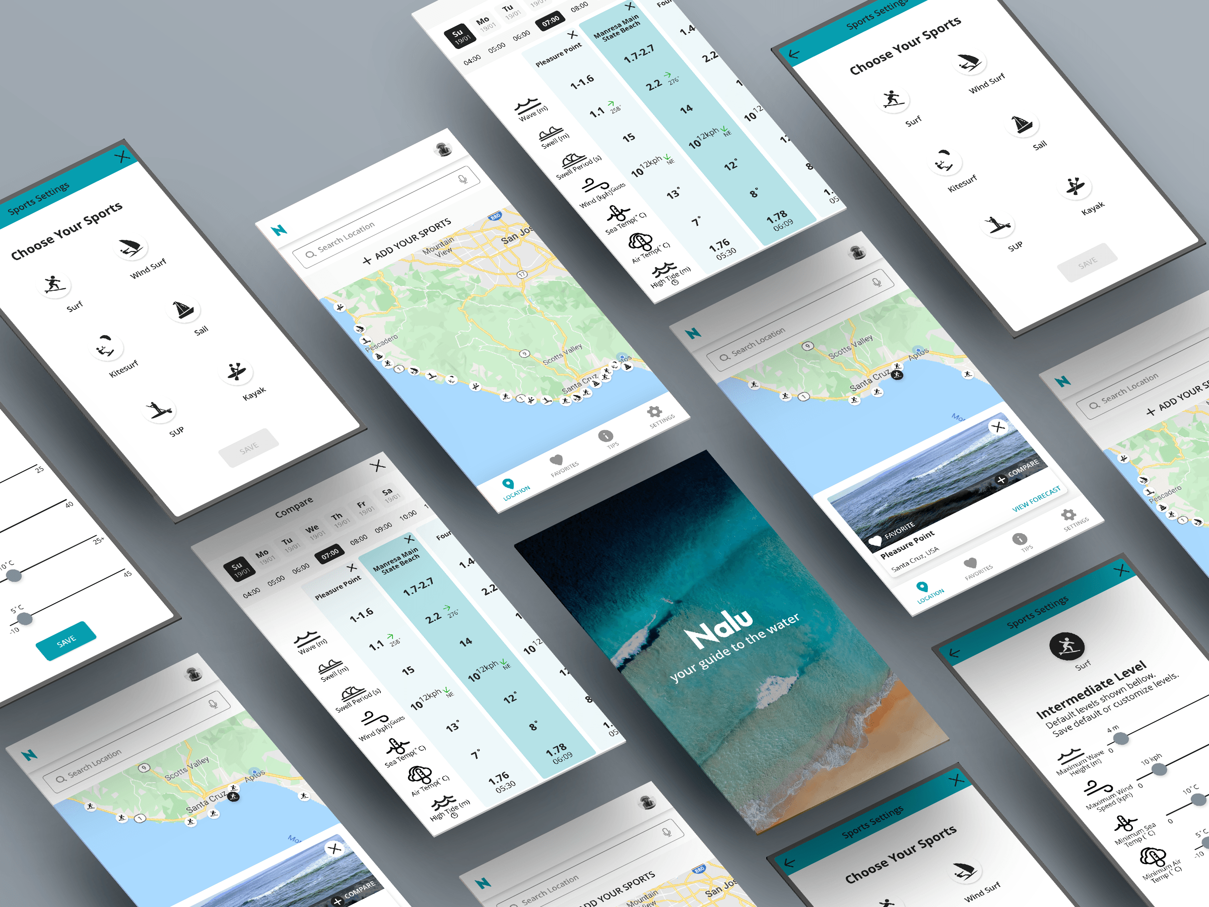
Nalu is a weather forecasting application for water sports. It allows users to view locations that have water conditions within their skill level and to compare locations when they are unsure of where to go for the day.
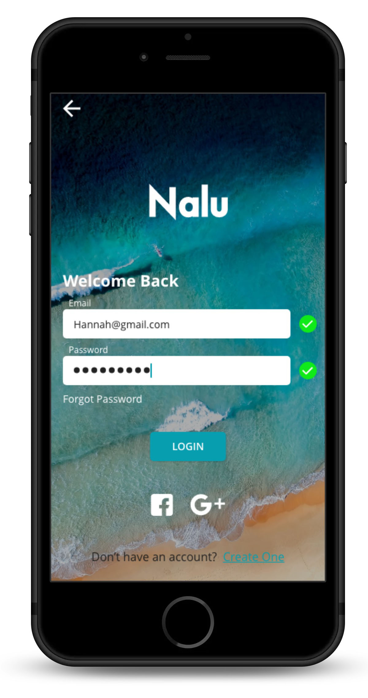
Login Screen
I designed a simple login screen with only the necessary login input so that users can get into the application quickly.
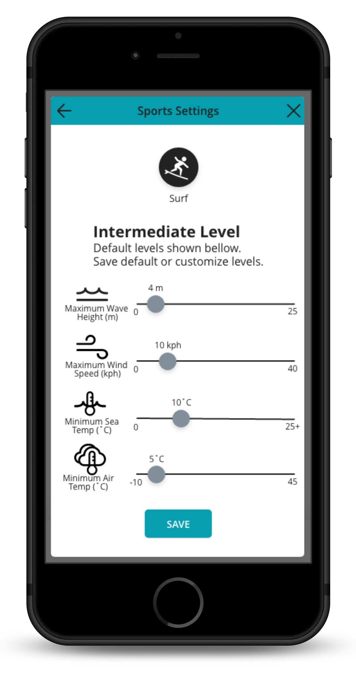
Sport Settings
Users can choose the sports they practice and select their level. If they do not feel comfortable with the default settings, they can adjust these levels to their liking.
Once saved the map will show locations that have conditions within the parameters they have set.

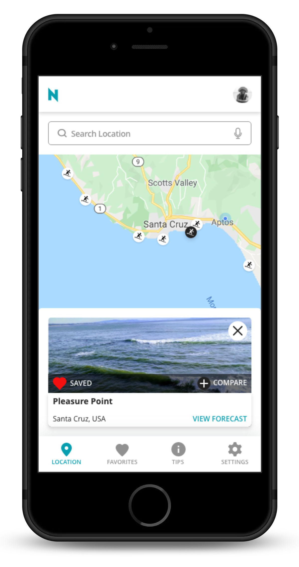
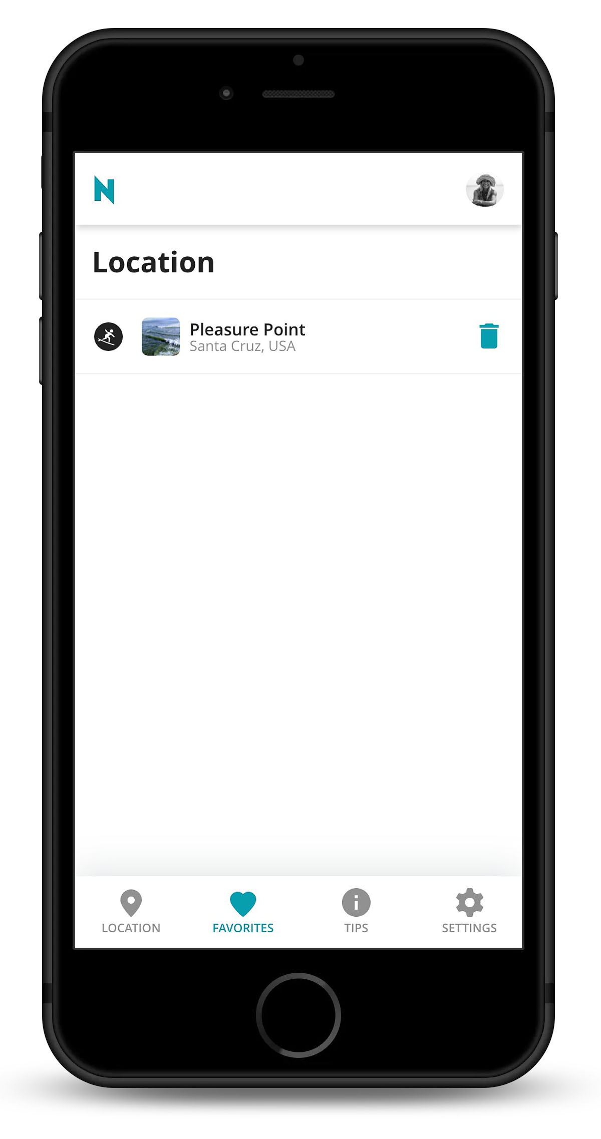
Adding a Favorite
Want to save locations as a favorite so you don't have to repeatedly search for them?
When viewing a location, users can easily save it as a favorite by tapping/clicking the heart. Then they can navigate over to the favorites tab to view at anytime.
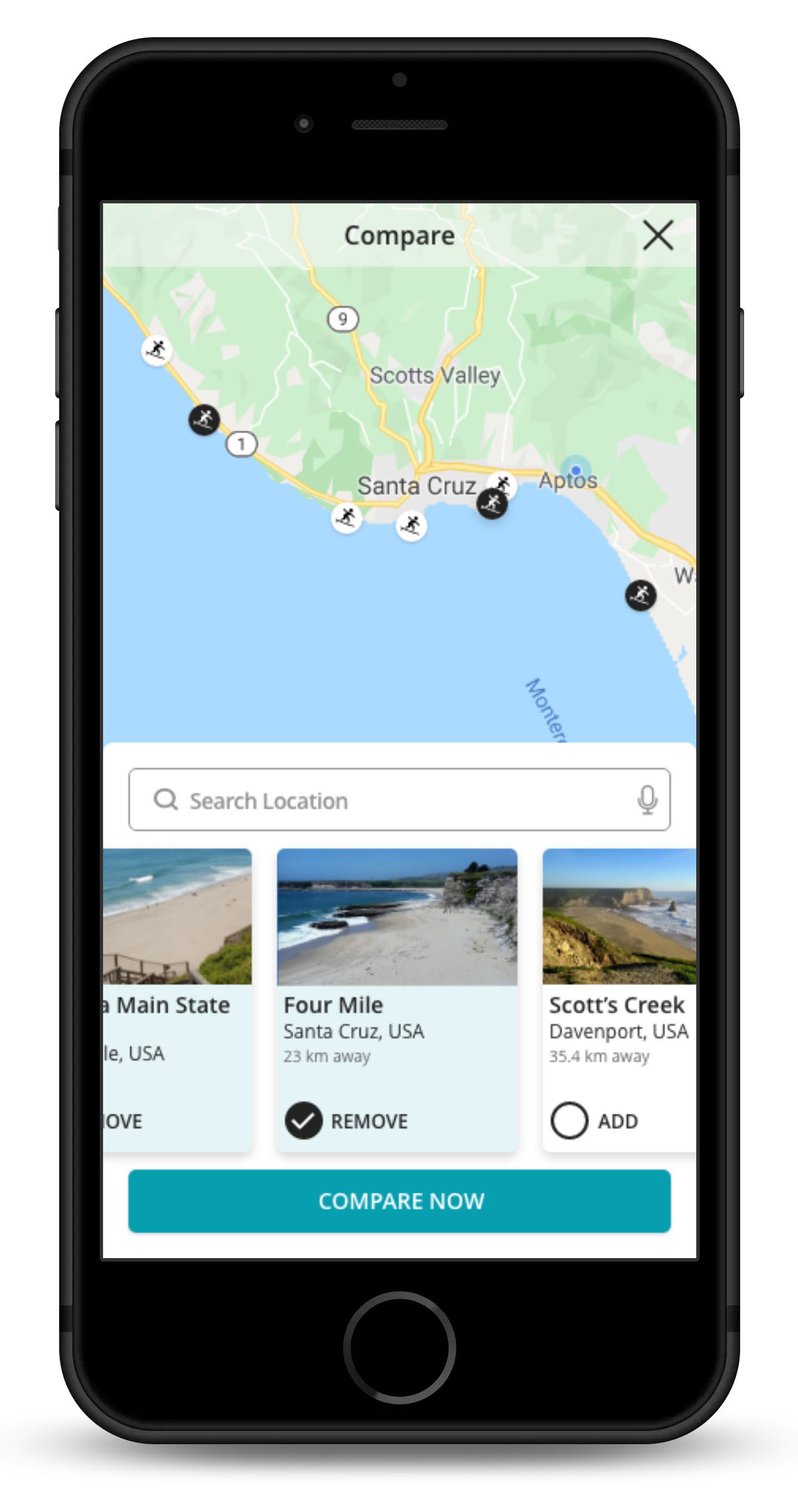
Compare Locations
Not sure where to go for the day? Users can choose which locations they want to see when they click on the compare button on any of the initial location cards.
Select as many as wanted, they will be highlighted on the map to allow users to gauge their distance from their current location. Users can then view their selections and see which place is best.
Want to view the entire design?
Click below for the full prototype
Learnings
You never know where an idea will sprout from.
I learned so much throughout this course about the design process. Some of my biggest takeaways are:
- The value of sketching and rapid iterations. I loved the process of sketching and seeing how my ideas developed from one drawing to the next.
- How important it is to use the personas as a reminder of who you are designing for.
- I need to be more specific when creating my objectives for user testing so that I can draw clear conclusions from the data gathered.
- My prior experience communicating with others and conducting research made the discovery phase of the design process go quite smoothly. I was able to hone in on the gaps in the market and the pain points of the existing applications.
Thank You!
Thanks to Carlo Van Der Pluijm and Piet Alberts for their guidance throughout this journey. To Hilary Duff, a special thank you for ensuring that my work is grammatically correct.
© Sarah Eisman 2025