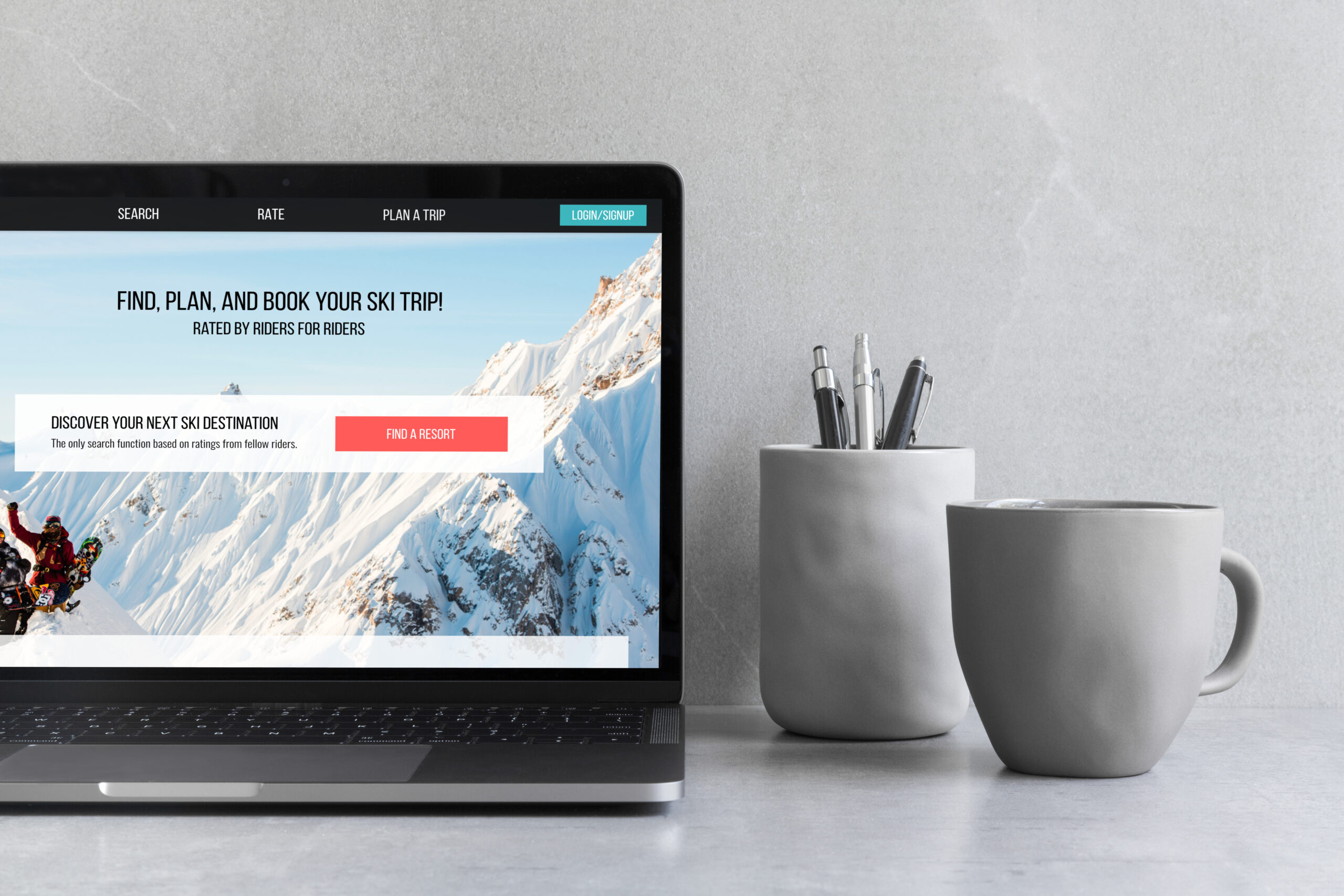
Ratoong Homepage
UX / UI Design | Branding
Overview
Project Context
Company: Ratoong - https://www.ratoong.com/
Company description: Ratoong is a platform for users to discover and plan their next ski or snowboarding holiday.
Sector: B2C
Date: January - March 2021
Collaboration with: CEO, Development team, & Design intern
My role: I was the lead designer on this project. I was responsible for the strategy, user flows, and design deliverables.
The Challenge
Ratoong was in the middle of a rebranding and needed a new homepage to reflect the company's new direction. The company was moving away from being a platform focused on rating ski resorts to a platform that assists users in finding and booking their next ski holiday.
I was the sole designer at Ratoong during this redesign and was responsible for both the web and mobile designs. That being said I worked in close collaboration with the CEO, COO, and lead developer, throughout the entirety of the project from conception to production.
Goals
Interconnectivity
To highlight the new and updated features as well as to increase interconnectivity across the platform.
Simplicity
Maintain navigation simplicity throughout the platform despite the added features.
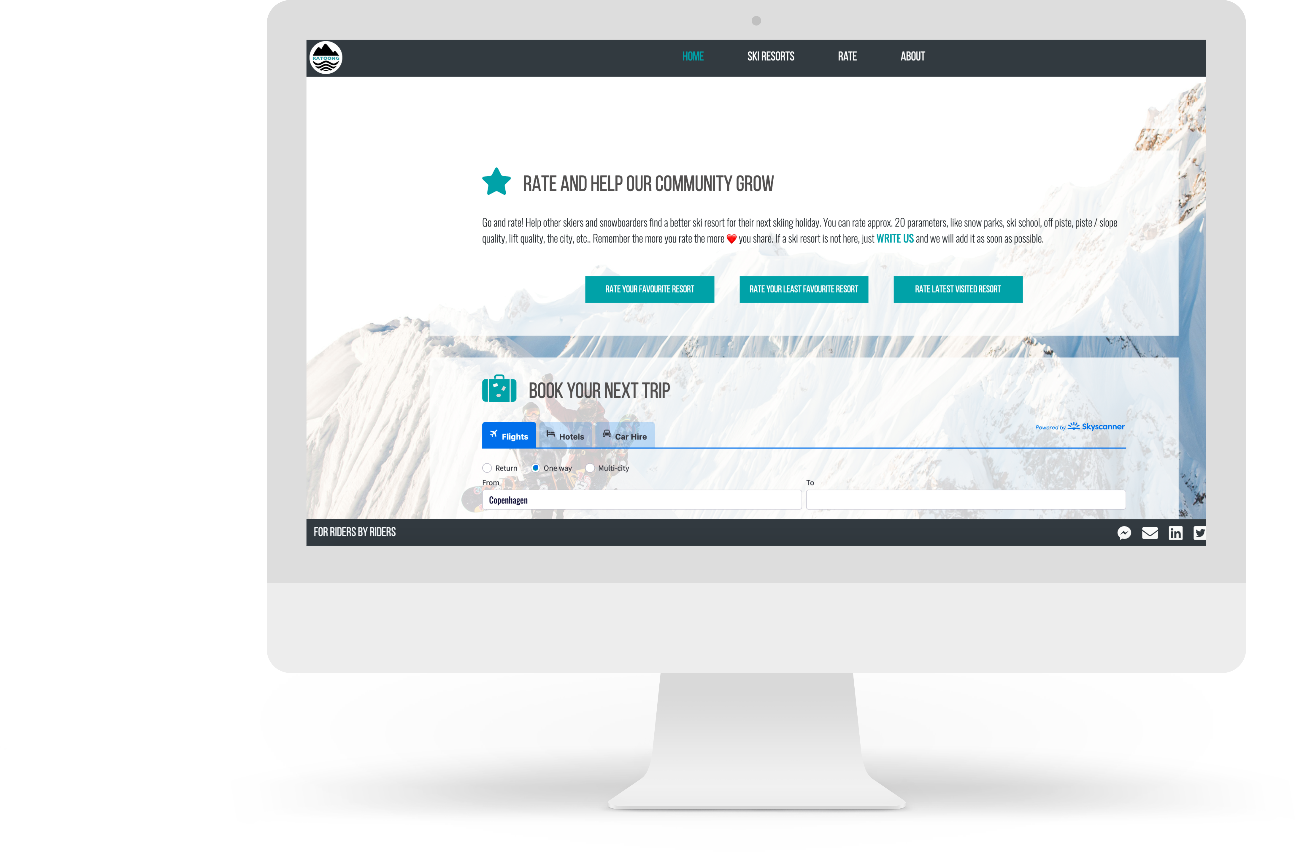
Old Homepage
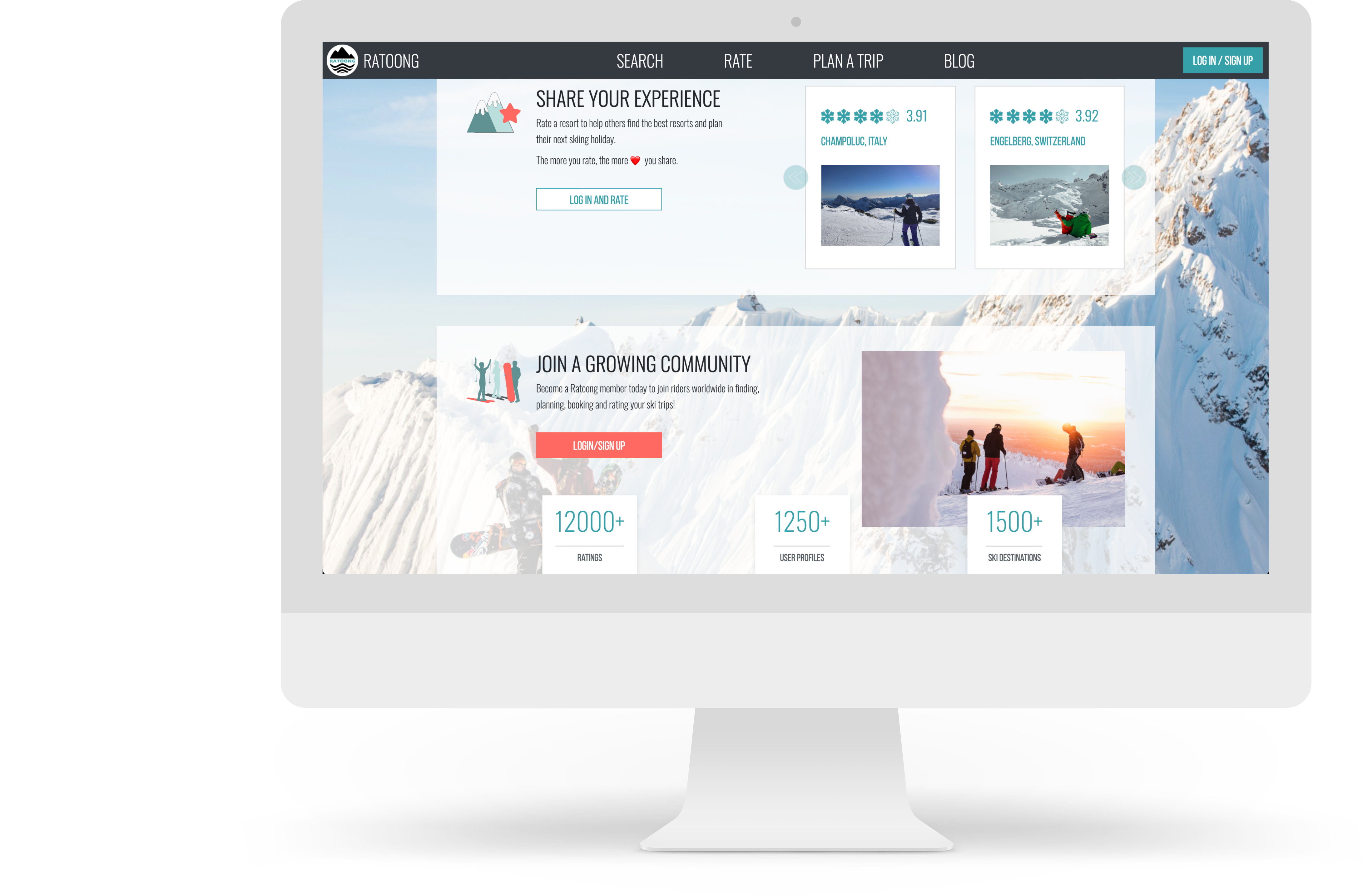
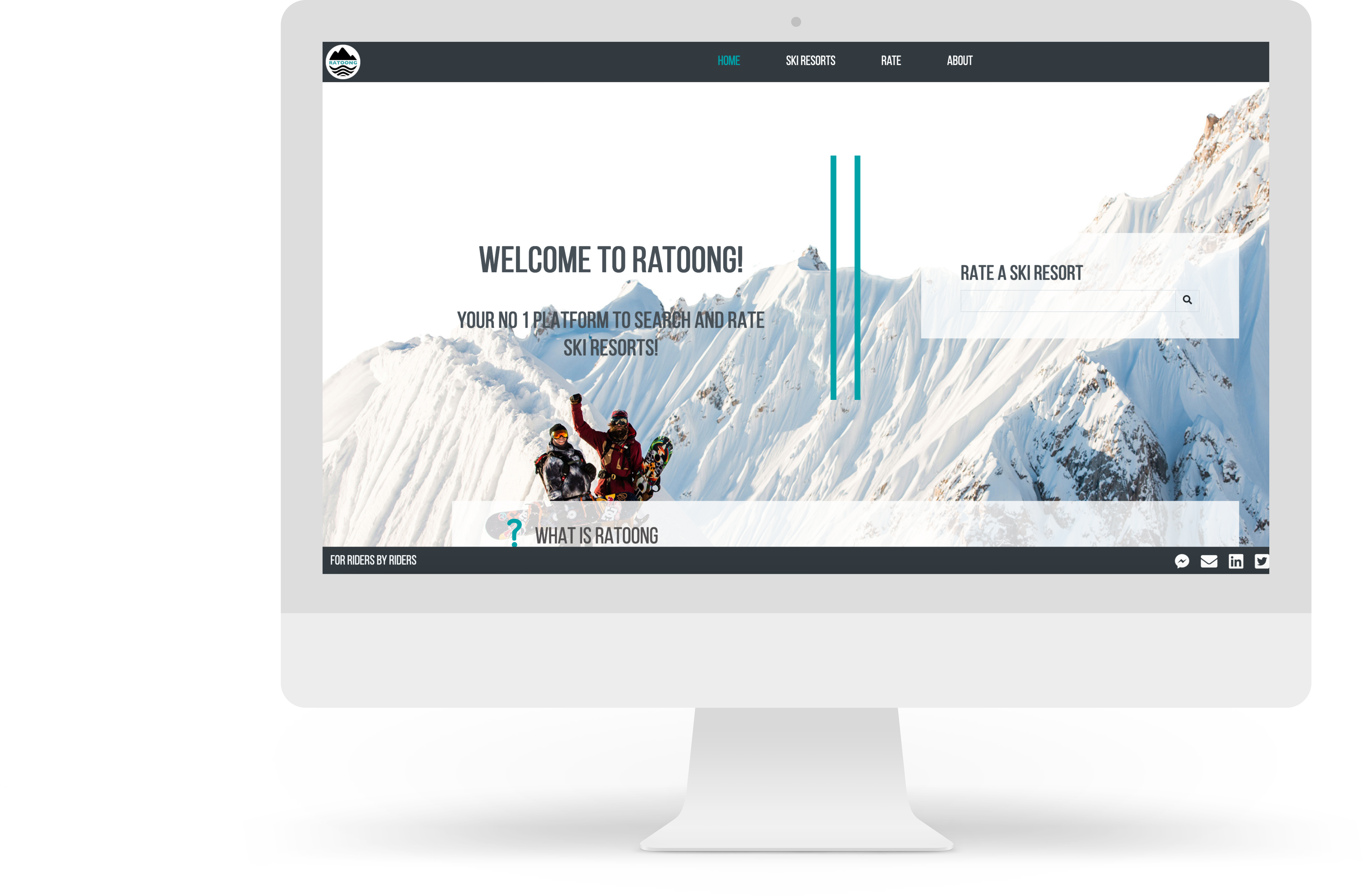
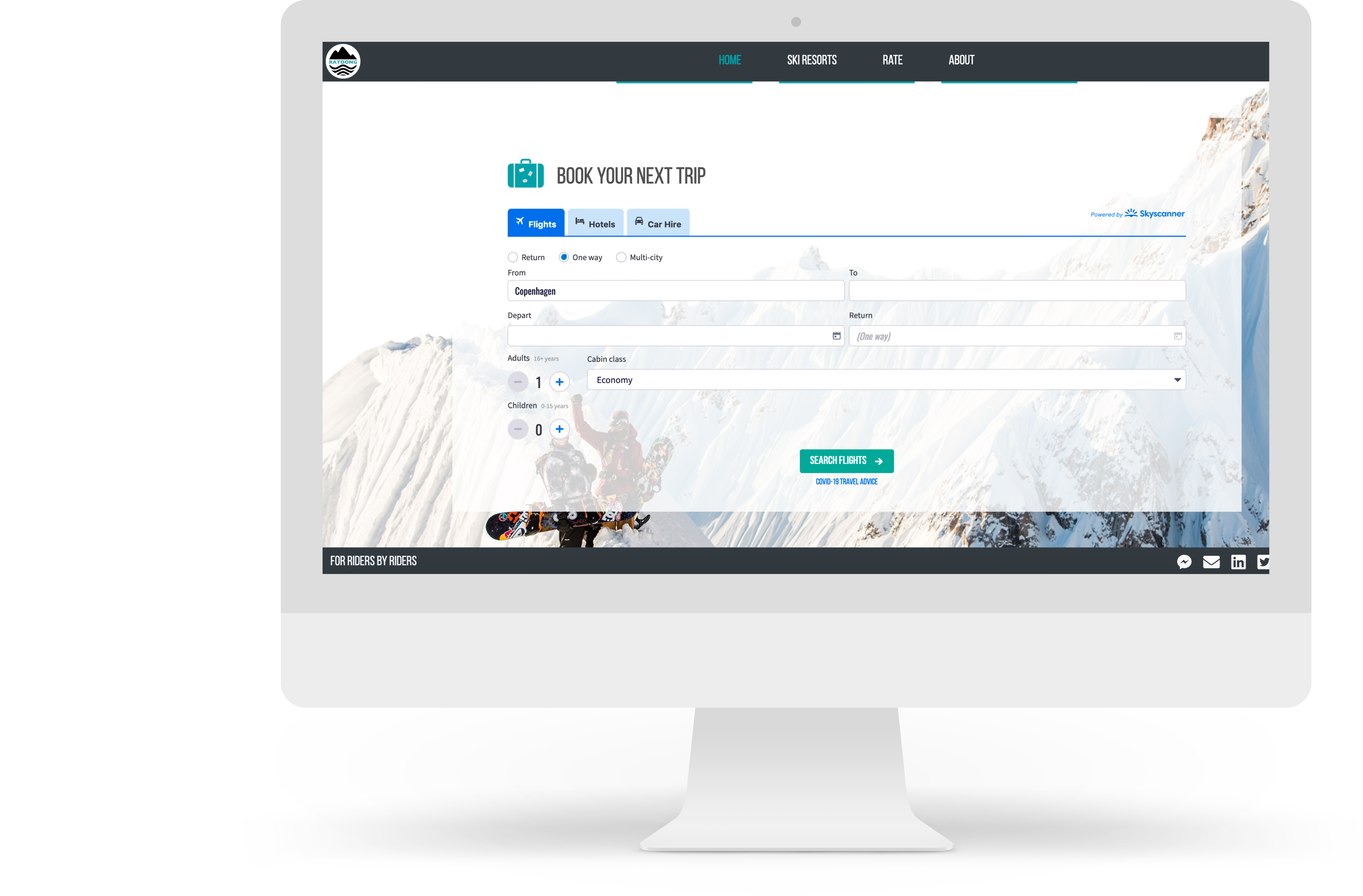
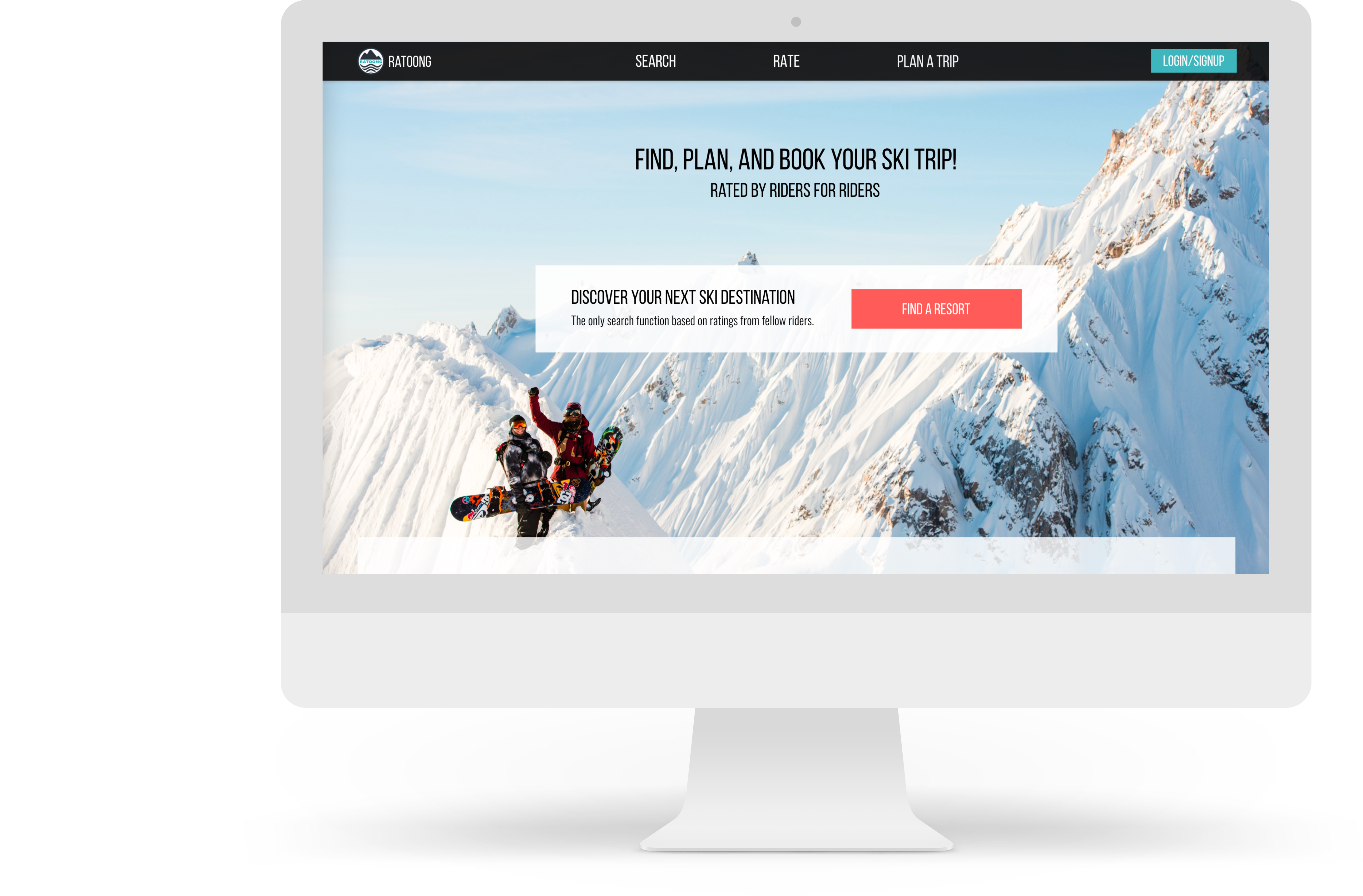
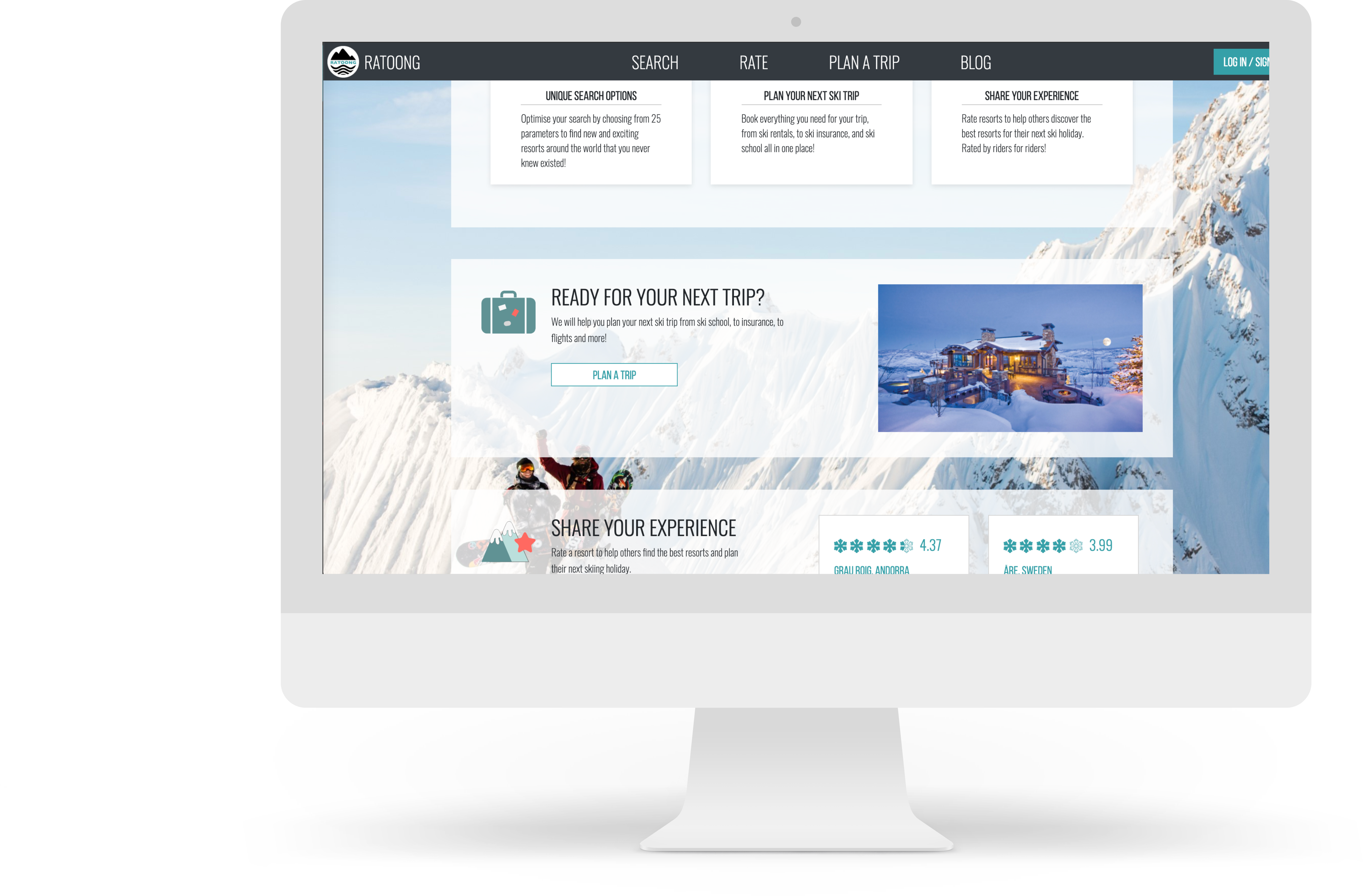
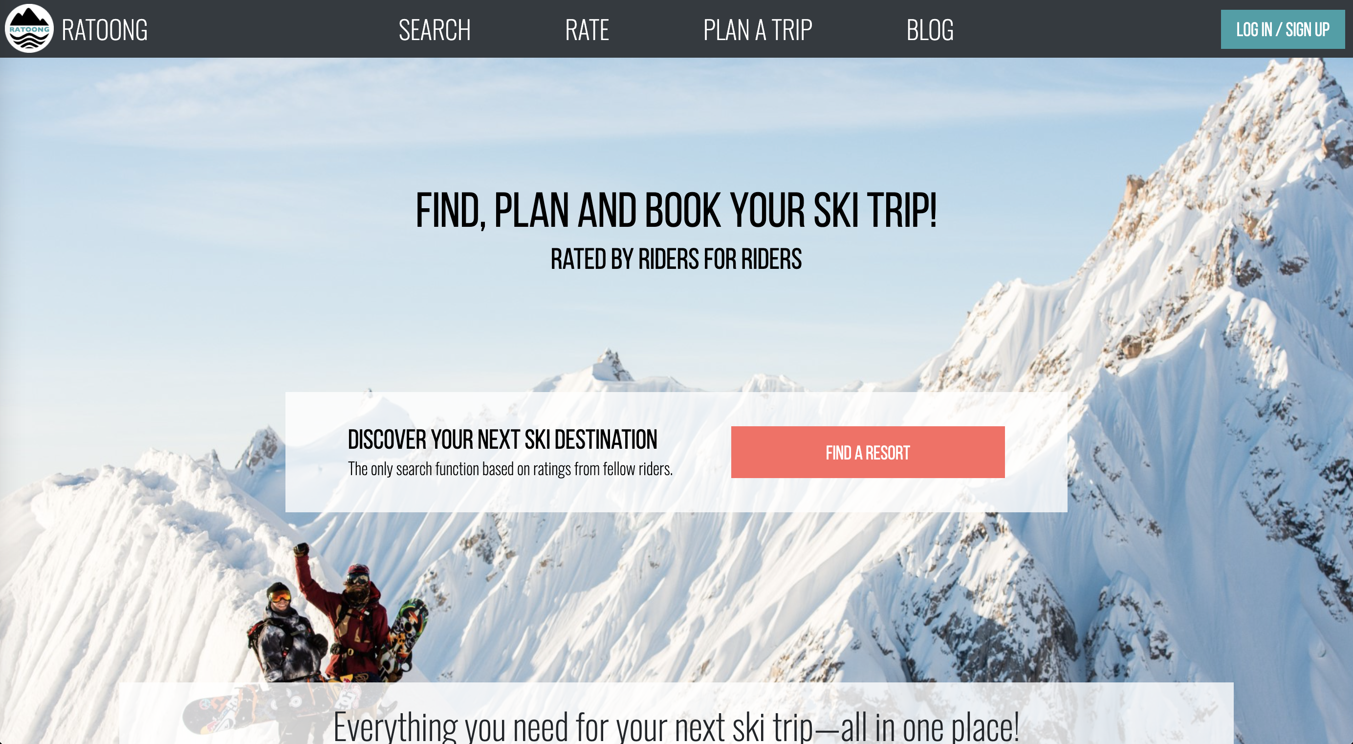
New Homepage
Discover
Research
A research phase focused on an audit of the current homepage, information architecture, user flows, usability tests, and internal discussions on the future strategy and direction of the company.
The re-evaluation of the site's information architecture influenced the design decisions. I conducted a content inventory to examine the current structure of the site. Two site maps were created, one to reflect the current offerings of the platform and the second to reflect the new features and changes being made.
Looking at the current information being highlighted on the homepage and comparing it to the updated site map, and taking into consideration the goal of highlighting new features, I was able to start reorganizing the content on the homepage.
Define & Ideate
Sketches
Once the discovery phase was completed, it was quickly followed by initial sketches and wireframes of the digital experience.
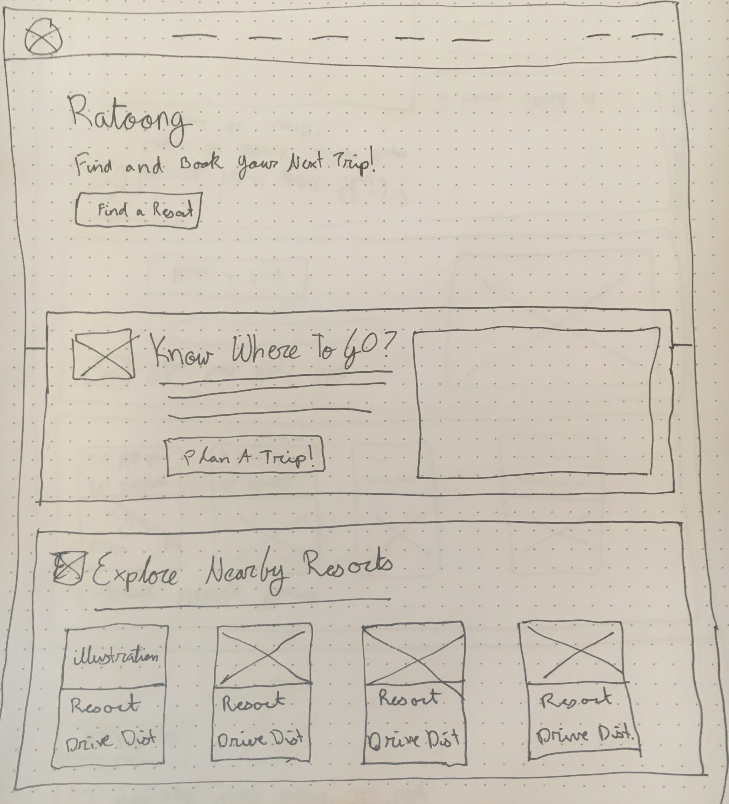
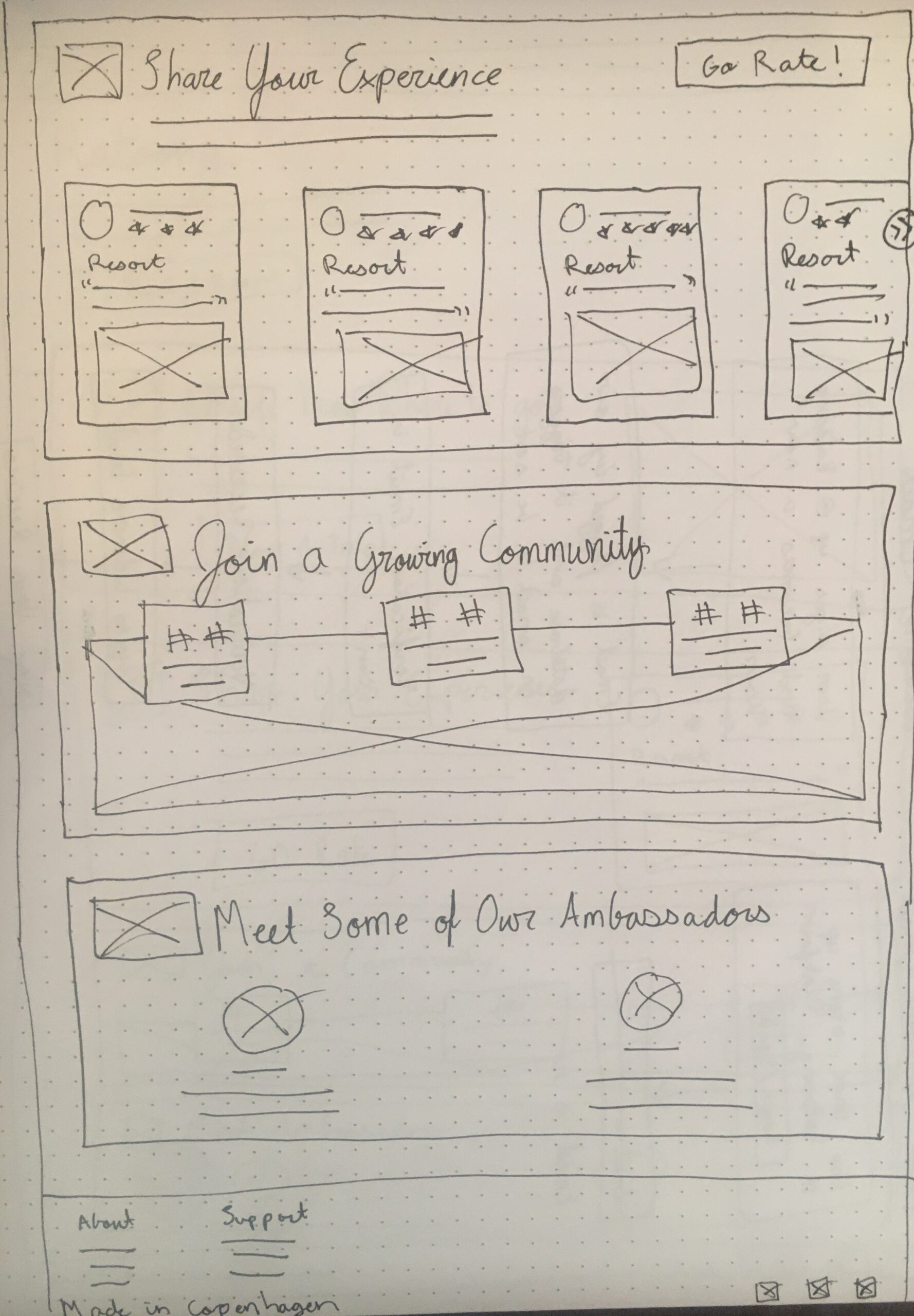
Key Design Considerations
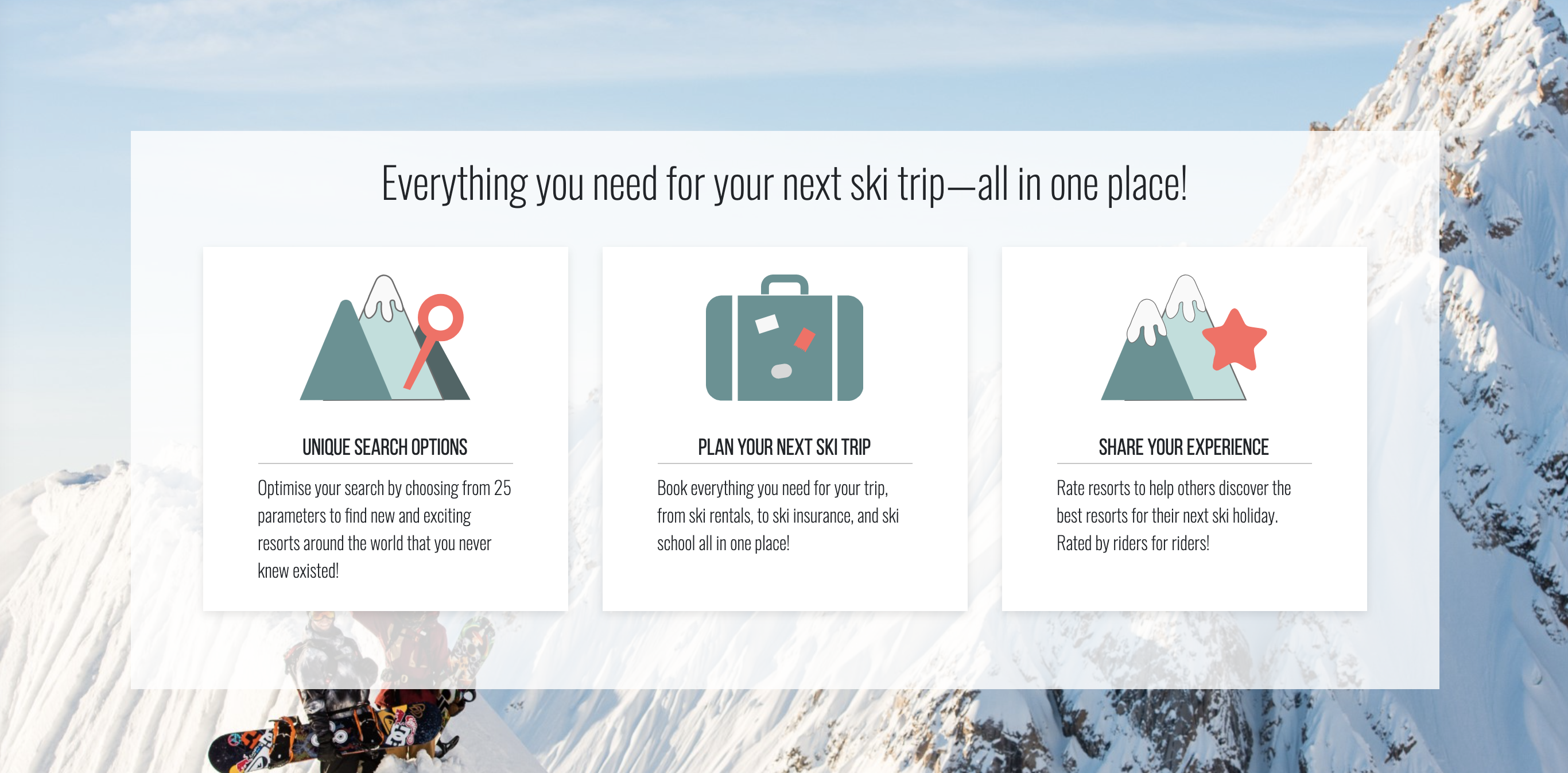
- The initial view of the page will no longer be focusing on rating resorts but instead guide users to discover resorts to book for their next trip. The primary method of searching on the platform is not by resort name but by personal preferences. For this reason, instead of having the customary search bar on the homepage, a CTA was used to transfer users to the search page.
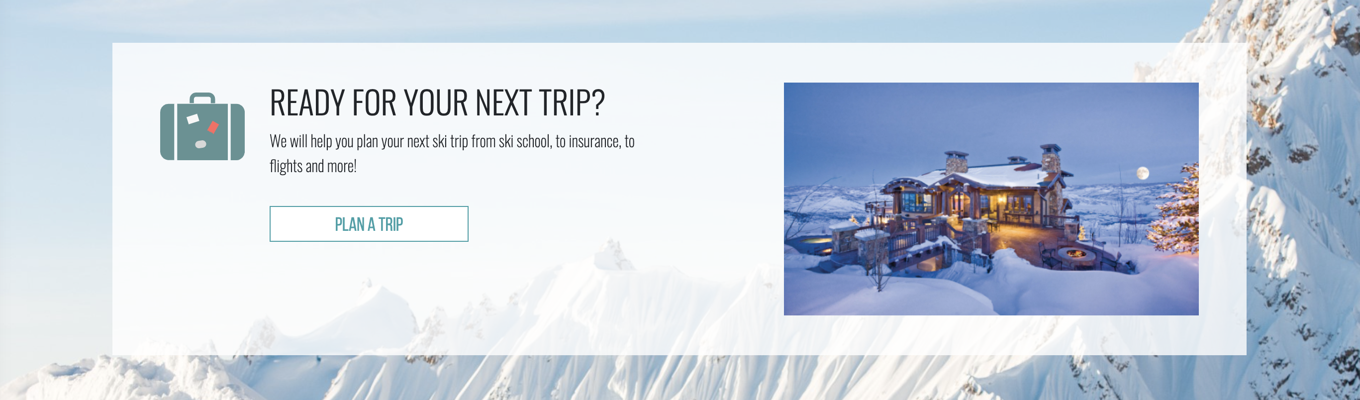
- The explanation of the company and the Skyscanner widget were moved to other pages in the site where they were more relevant.
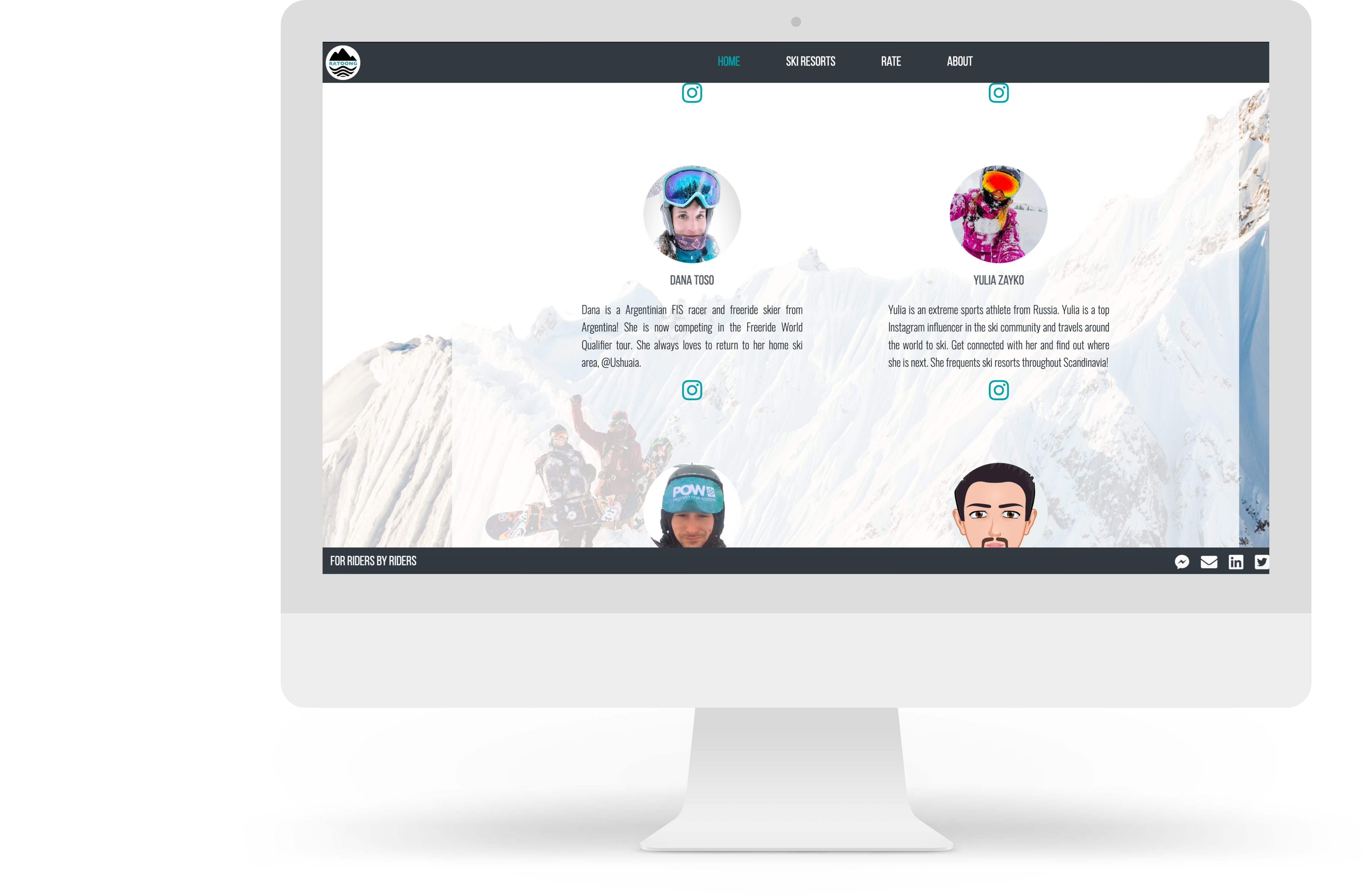
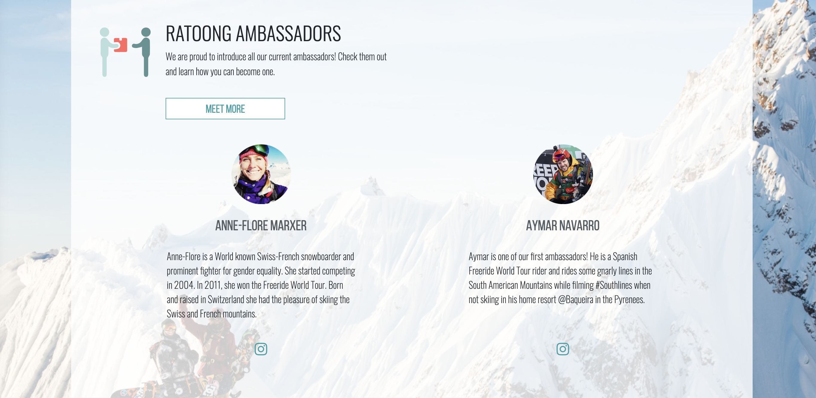
For the ‘Ambassador’ section, it was decided to highlight only two on the homepage. - The remainder of our ambassadors would be moved to a separate page accessible by the button CTA. However, until the new page is created, it was decided that the button CTA will expand the section on the homepage to reveal all the ambassadors.
- The homepage was redesigned in a modular system to allow flexibility, seamless evolution over time, and to maintain consistency with the rest of the platform. Within the sections, images would be added in order to increase the warmth of the site.
Old Designs
New Designs

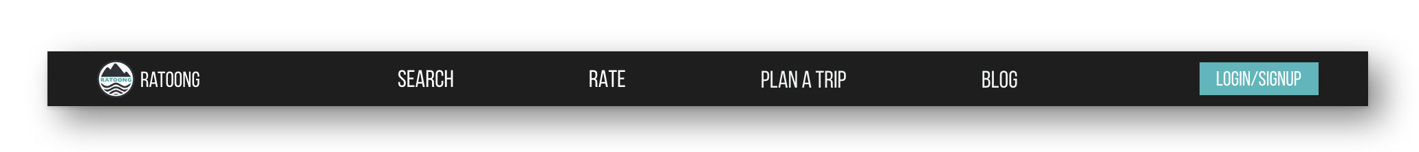
Navigation Concept
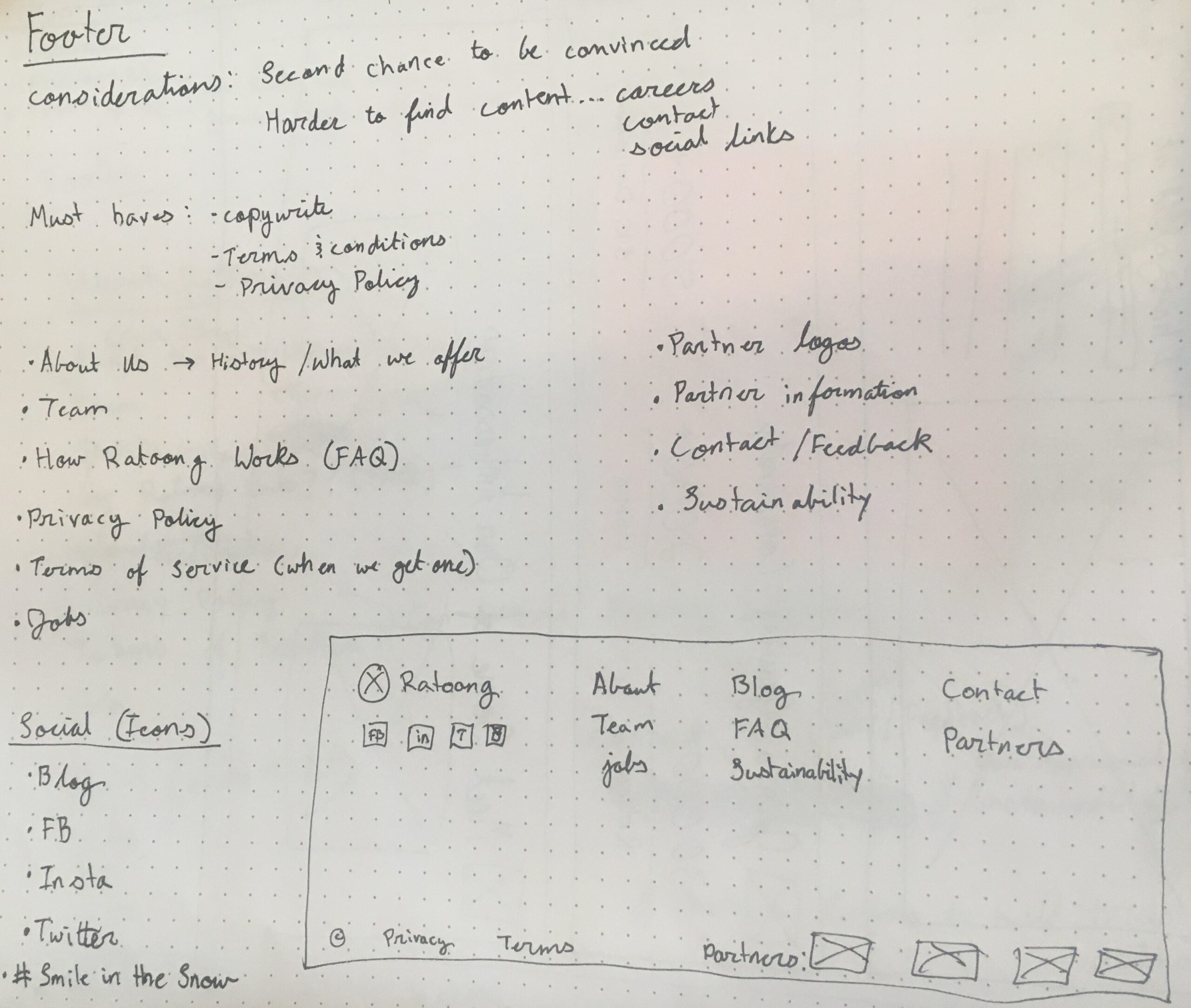
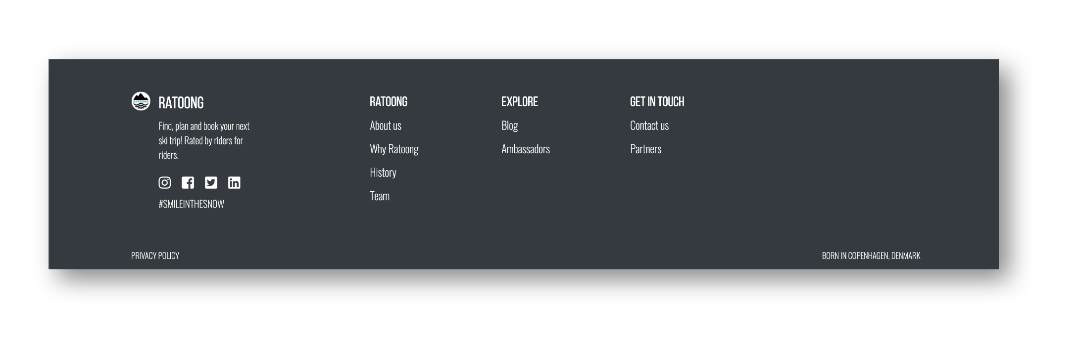
Examining the information architecture of the site lead to the decision to update the navigation and redesign the footer of the site in order to reflect the new features, maintain simplicity, and enhance the user experience.
The footer was designed with scalability in mind. Two versions were designed, one that could be implemented now reflecting the current platform architecture and one that reflects the future direction of the platform.
Key Design Considerations:
- To not overload the top navigation with the ‘Plan A Trip’ and ‘Blog’ links being added, the ‘About’ page link was moved to the footer.
- The ‘Home’ link was removed because users can access the homepage via the logo in the right corner of the navigation bar as is customary with many sites.
- With the new signup and login flow being combined, these two links were made into one. To capture the user’s attention, the text link was made into a button.
Old Navigation
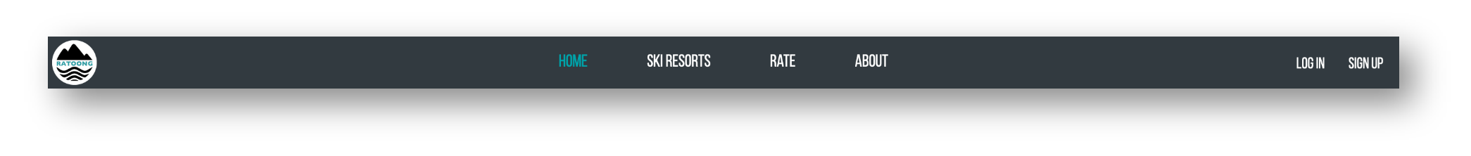
New Navigation
Old Footer
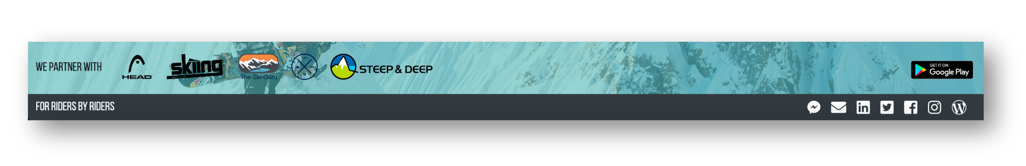
New Footer
Iterations & Interactions
Validating & Iterating
Testing of an earlier iteration confirmed that the designs were clearly conveying the new branding of Ratoong. It also revealed that some of the content displayed in the designs didn’t quite align with users’ expectations and needed to be changed to better reflect what the platform has to offer.
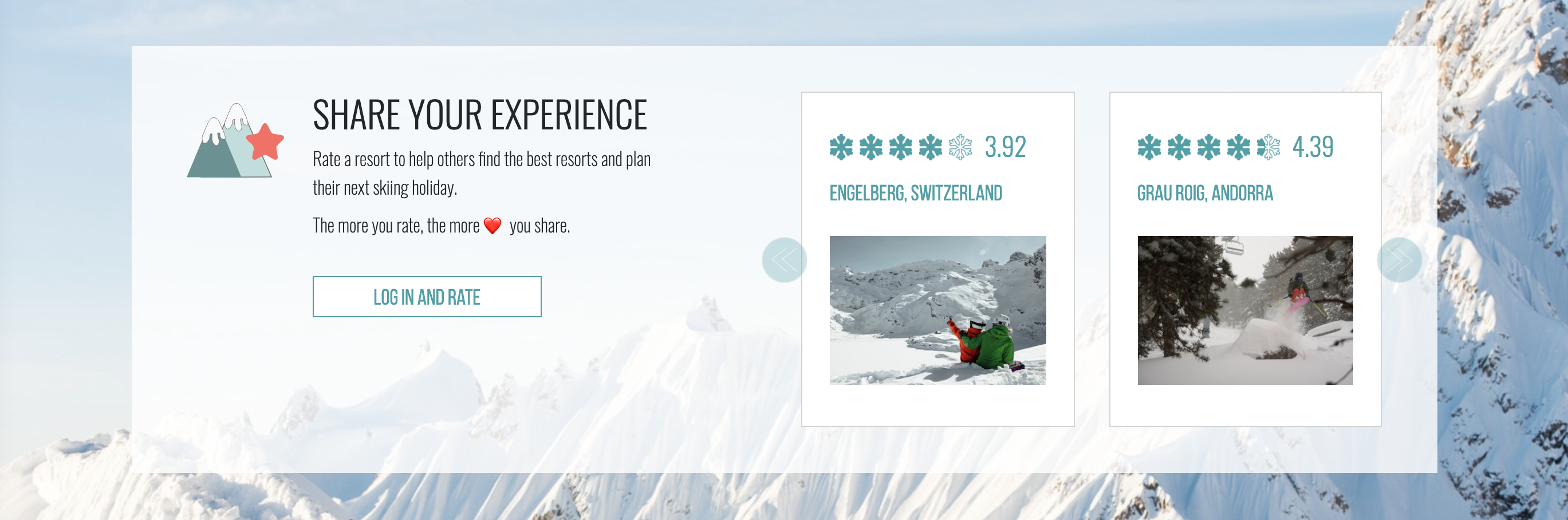
The prior homepage was static and informational so in order to increase movement across the platform, functionality was added throughout the homepage. After the initial designs were made, a CTA to log in or sign up was added to the community section to provide users with easy access to joining the community.
Additionally, a highlight reel of the platform's main features was added to the upper section of the homepage to immediately show users the value of the site. I worked closely with the lead developer to add some animations to make the homepage more interactive.
User Interface Highlights

Mobile Design
See it live at:
© Sarah Eisman 2025